
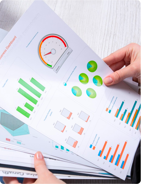
Make the most out of your data
Data can be converted to real business assets. Analyzing and visualizing the data in an intuitive and meaningful way, relevant to different user categories including customers, operational team and management empowers them to make informed decisions, improve productivity, reduce errors and resource wastage. We have designed operational and CXO dashboards across multiple industries including retail, healthe care, energy management, FinTech, stock trading and Web3/DeFi.


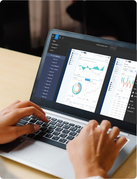
Our Dashboard design expertise
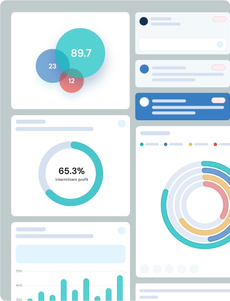
Our Digital Dashboard Designs services will transform your raw data into highly effective visual analytics to help you gain deeper better business and operational insights visibility.
-
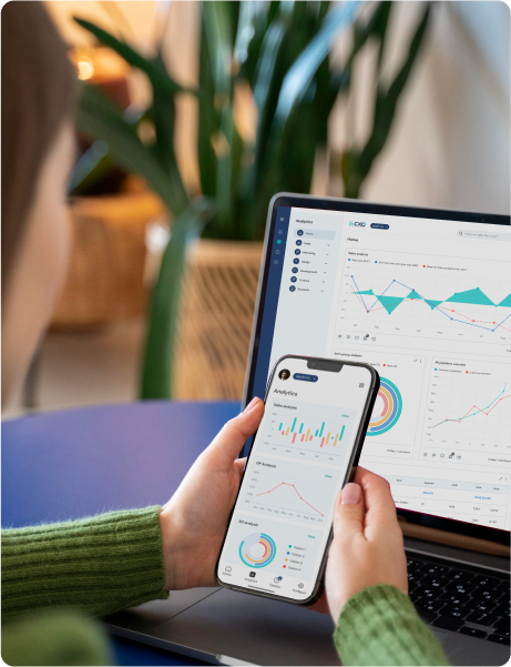
Web app dashboard design
Tailored interfaces optimized for web apps, providing comprehensive data insights and functionalities accessible across browsers.
-
Mobile dashboard design
Customized layouts specifically crafted for mobile devices, enabling users to access crucial data on-the-go, with intuitive visuals and precise insights.
-
HMI dashboard design
Interfaces designed to facilitate seamless interaction between humans and machines, presenting data in an easily comprehensible manner for real-time monitoring and control.
-
War-room dashboard design
Specialized dashboards created for high-stakes scenarios, aggregating critical data and visualizations in a single interface for rapid decision-making in time-sensitive situations
-
Power BI dashboard design
Our Power BI dashboard designs are built to reflect the structure of your business and the priorities of your leadership. From performance monitoring to operational diagnostics, we design interfaces that distill critical data into actionable formats, supporting informed decisions at every level.
-
AI dashboard design
Dashboards with a built-in LLM & chat interface that lets users ask questions in natural language and receive clear, usable answers. We design prompt flows, response layouts, and trust cues so insights stay credible and easy to act on.
-
AI-assisted interactive dashboard design
Interactive dashboard design with AI-guided exploration, including drill-down paths, smart filters, and insight suggestions that reduce analysis friction. Built on strong data visualization UX, this supports analytics dashboard design and business intelligence dashboard design for faster decision-making.
Our Dashboard design projects
Explore our array of dashboard designs, from strategic to operational and analytical dashboards, for web and mobile interfaces.
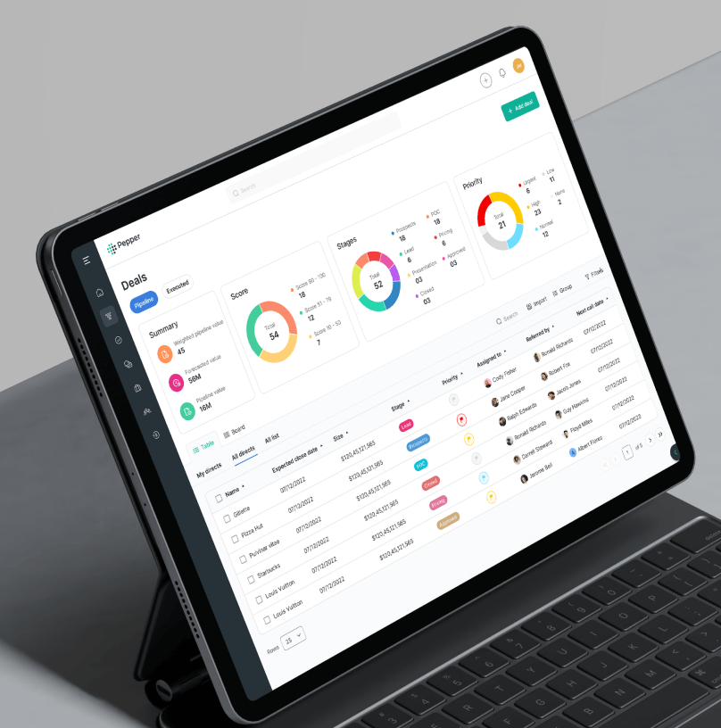
A data-driven dashboard design that transformed complex asset data into clear, actionable investment insights.
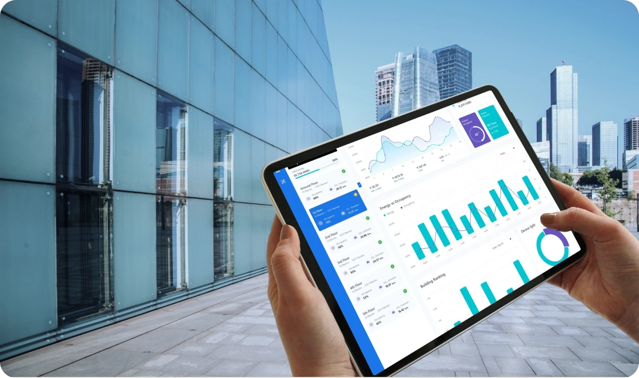
A data-driven dashboard design for a cloud platform that simplified energy, device, and space management across buildings

A UX transformation for Roca that streamlined legal notice tracking and improved compliance visibility across departments.
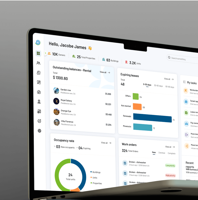
A product experience overhaul for a US property platform, streamlining leasing, payments, and communication.
A DNA Paris Award-winning redesign that empowered CXOs with intuitive, interactive dashboards for faster strategic decisions
How do we design dashboards tailored for your needs?
Following a well defined dashboard design process helps us gather the right inputs to build a dashboard that meets your exact needs.

Define the audience and goals
What decisions do they need to make? What are their key performance indicators (KPIs)? A good understanding of the audience and goals help us identify the specific data and visualizations that will be most useful to users.
Collect and prepare the data
Once we identify what data we need, we collect it from various sources and prepare it for visualization. This may involve cleaning the data, removing outliers, and aggregating it at the appropriate level.
Choose the right visualization types
From the many visualization types available, such as charts, graphs, and maps, we choose the ones that best communicate the data and help the users take the right actions for their purpose.
Design the dashboard layout
Based on user requirements, we decide a layout by grouping related metrics together and using visual cues to help users identify the most important information quickly.
Test and iterate
We test the dashboard with users and gather feedback to identify areas of improvement and iterate the design to make necessary changes, before deploying to users.
Business Benefits of well designed digital dashboards
The raw data can be transformed to well conceived and designed dashboards, that can help you achieve:


Build actionable dashboards with Aufait UX

Strong Track Record
Aufait UX's robust foundation and extensive tenure in UI/UX design demonstrate our stability, commitment, and adaptability in this dynamic industry

Winner of International Design Awards
Aufait UX has won global design awards, showcasing our excellence in creating standout user experiences.

Enviable Customer Logos
Our partnerships with global brands highlight our ability to consistently meet the diverse and exacting design needs of renowned companies.

Global Reach and Impact
Aufait UX's global reach broadens our influence. Working with clients worldwide, we excel in diverse markets.
Frequently asked questions
What do your dashboard design services include?
Our dashboard design services cover UX strategy, information hierarchy, layout design, visualization selection, interaction patterns, and UI design systems. We align dashboards to business goals, user roles, and decision frequency so insights stay actionable.
What information do you need to start a dashboard design project?
We typically need your user roles, KPI definitions, sample datasets or data fields, current reports, and the decisions the dashboard is expected to support. If these inputs are still evolving, we help you structure them through discovery workshops.
Do you offer business intelligence dashboard design for leadership and CXO reporting?
Yes. Our business intelligence dashboard design focuses on executive clarity: fewer, higher-signal metrics, strong context, and drill paths that answer follow-up questions fast. We also design narrative flows that make performance reviews easier to run.
How do you approach analytics dashboard design for product, operations, or growth teams?
We design analytics dashboards around the decisions each team needs
to make and the metrics they track most closely. For product teams, that may include adoption,
retention, and feature usage. For operations teams, it may involve efficiency, bottlenecks, and process
visibility. For growth teams, it often focuses on conversion, acquisition, and campaign performance.
Our approach structures the dashboard so users can begin with a clear overview and move into deeper
analysis through filters, drilldowns, and segmented views. We design for clarity, exploration, and
decision support, helping teams interpret trends, identify anomalies, and act on insights more
effectively.
What makes interactive dashboard design effective in real use?
Effective interactive dashboard design is built on predictable filters, clean drilldown logic, clear states, and responsive performance cues. We design interactions that feel stable and intentional, especially for complex datasets.
What does “data visualization UX” mean in dashboard projects?
Data visualization UX is the practice of making charts, tables, and patterns easy to interpret through hierarchy, labeling, context, and cognitive load control. It ensures the dashboard is readable at speed and reduces misinterpretation risk.
Can you design AI dashboard design experiences with chat-based analytics?
Yes. Our AI dashboard design work includes conversational flows, prompt guidance, response layouts, and trust signals so users understand where insights come from. This is especially useful when dashboards serve mixed audiences with different data literacy levels.
How do you ensure the dashboard design matches our brand and product UI?
We create a dashboard UI aligned to your design system, brand palette, typography, and component rules. If you don’t have a mature system yet, we define reusable components so future dashboard screens stay consistent.
Do you redesign existing dashboards that users find confusing or heavy?
Yes. We audit the current dashboard for clarity gaps, metric overload, weak hierarchy, and interaction friction, then redesign the experience around user intent and decision flow. This is a common engagement when adoption or trust has dipped.
What is the typical timeline for dashboard design services?
Timelines depend on scope and the number of user roles, but most dashboard design services engagements run in structured phases: discovery, wireframes, visual design, and handoff. We share a clear plan with milestones once we review your requirements.
Who are the major customers Aufait UX has worked with?
Aufait UX has worked on dashboard and data-heavy UX engagements for products such as BiCXO, IQnext, Pepper, Email Tracker, PropertyZar, and Roca. For BiCXO, we redesigned a business intelligence platform for C-suite users, improving interactivity and executive usability. For Pepper, we designed an investment data dashboard that made complex asset information easier to interpret and act on. Email Tracker involved designing a clearer analytics experience for email deliverability and performance insights. PropertyZar included role-based dashboards for landlords, tenants, and property managers, while Roca featured a custom dashboard UI/UX built as the home screen for legal and case visibility. We have also worked on operationally complex platforms such as ID Foods, where our UX work helped streamline sales, distribution, and finance workflows.
What is your Dashboard UX design methodology?
Our Dashboard UX design process has the following steps:
1. Discovery and user understanding We study
the users, business goals, reporting needs, and key metrics the dashboard must support.
2. Information architecture and dashboard structuring
We organize the dashboard content and insight flow so users can interpret information quickly
and move deeper when needed.
3. Wireframes and visual design We design the
layout, interaction patterns, and visual hierarchy to create a dashboard that is clear, intuitive, and
decision-friendly.
4. Validation and handoff We refine the design
through feedback and deliver implementation-ready assets for development.
In which countries does Aufait UX provide services?
Aufait UX provides dashboard UX design services for clients across regions and has a visible presence in India, the USA, and the UAE through its listed offices. Its portfolio also reflects work across varied business contexts and international products, including a US property platform and enterprise dashboard projects in finance, smart-city data, and building management.
Which platforms do you design dashboards for?
Our dashboard UX designs are largely platform-independent and can be implemented on the platform that best fits the product, data environment, and user workflow. This includes web app dashboards, mobile dashboards, HMI dashboards, war-room dashboards, desktop web dashboard environments, and Power BI dashboard design.