Dashboard Design: What Projects Teach You That No UX Principle Can
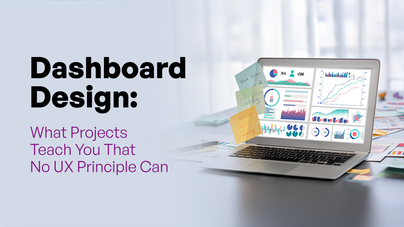
Charts are for looking; dashboards are for acting. Ditch the visual noise and discover the invisible layout psychology that lets users decode data in five seconds flat.
Summary
Nobody designs a great dashboard on their first attempt. I certainly didn't. My early work was shoddy. But those failures taught me a ground-level understanding of what dashboard design demands. Good dashboard design turns data into decisions. It establishes clear priorities, surfaces meaningful context, balances user needs with business and technical realities, and presents information in a way that supports action. This article is my practitioner's account of that journey with the projects, the mistakes, and the lessons that only come from doing this work for real.
A client once told me they didn't want red on the dashboard because it might alarm the sales team.
I've heard versions of that objection more times than I can count. And every time, it points to the same underlying problem that the team is thinking about how the dashboard feels rather than what the dashboard is helping people do.
Most teams still approach dashboards as a collection of attractive charts arranged neatly on a screen. They debate chart types, maintain visual consistency, polish interactions, and obsess over layout. That is dashboard UI work, and of course, it matters. But it is not the whole discipline.
Dashboard design is the discipline of organising and presenting data so that the right person can make the right decision at the right time.
I've spent years designing dashboards across fintech, operations, and enterprise platforms. This article is a distillation of what I've learned, the decisions that make a dashboard genuinely useful, the mistakes that look reasonable until they aren't, and the principles I come back to on every single project.
What 10 Years of Dashboard Design Has Taught Me
When I first began designing dashboards, I really had no idea what I was doing. I would sit down whenever inspiration struck and start placing widgets. My focus was on fitting in as many metrics and chart variations as possible onto a single screen, because that was what I thought dashboard design was.
Looking back now, those early experiences taught me that theory is useful. But the clearest lessons in dashboard design come from understanding what went wrong and specifically why.
When Showing Everything Means Prioritising Nothing
One project in particular reinforced a principle I still follow today. The dashboard needed to present six core business metrics that users relied on regularly. My first instinct was straightforward: if all six metrics were important, they should all be visible on the homepage. Alongside those metrics, I included summary insights and condensed tabular views to make the dashboard feel comprehensive.
The outcome was the opposite of what I intended. Because there was no hierarchy. The user would open the interface and face equal visual weight across every element. There was no clear signal about where to look first, what required action, and what was background context.
That experience taught me a lesson I have carried into every dashboard project since: users do not need more information. They need clearer priorities.
What the Redesign Revealed
The redesign required a deliberate reduction. Important alerts and actionable insights moved to the foreground, while major metrics remained on the primary view. Granular details, tabular data, and supporting numbers were moved to dedicated inner pages where users could explore them when needed. The dashboard stopped trying to be a complete data repository and started functioning as a decision-making surface.
What a Well-Designed Dashboard Does
I have also seen this principle applied exceptionally well in the Pursuit Lead dashboard. It is a sales-related dashboard that demonstrates what works. It opens with a clear snapshot of what's happening right now: conversion rates, average closings, campaign performance, revenue by source. It surfaces opportunities for conversion.
The user doesn't have to construct the narrative from scattered data points. The layout shows the current state, trajectory, opportunities, and key performance indicators. The information flows in the same sequence that a sales professional's mental model flows. When a dashboard is built to match how a user thinks, the cognitive load drops, and decision quality goes up.
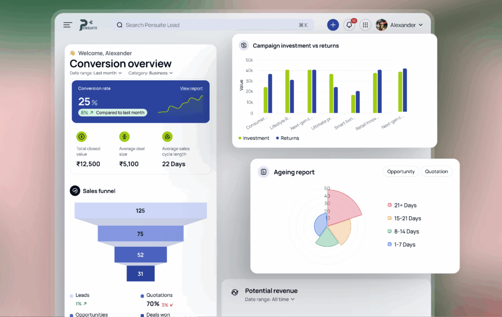
Caption: A clear snapshot of the Pursuit Lead dashboard puts conversion trends, campaign results, and sales opportunities in one easy-to-read view.
That is the lesson: When people ask me what good dashboard design looks like, my answer is rarely about charts, colours, or layouts. Good dashboard design creates clarity. Everything else is secondary.
Zeroing in on dashboard design also gave me a clear distinction between UI and UX. Dashboard UI design focuses on presentation. Dashboard UX design focuses on helping users interpret information, recognise what matters, and take action with confidence, often under time pressure and with incomplete context.
The Question Every Dashboard Design Must Answer First
One of the first things I try to understand before designing any dashboard is deceptively is what question this dashboard is supposed to answer?
Before I think about layouts, charts, colours, filters, or even wireframes, I need clarity on the role the dashboard is expected to play. If that part isn't clear, the design process quickly turns into a debate about components rather than decisions.
Dashboard design falls into three types: operational, strategic, and analytical.
In a simple punchline, I usually distinguish them as:
- Operational Dashboards (OD): What is happening right now?
They rely on real-time or near-real-time information, where visibility and speed matter most. - Analytical Dashboards (AD): What does the data tell me?
They support exploration, comparison, filtering, and deeper investigation without overwhelming the user. - Strategic Dashboards (SD): Are we on track?
They are typically reviewed weekly, monthly, or quarterly, with a focus on trends, benchmarks, and long-term performance.
The moment that question is settled, at least half the layout decisions become obvious. I've seen teams spend three weeks debating chart types when the actual disagreement was about whether the dashboard was operational or strategic. Establish the type first and then everything else follows.
So before you sketch a single wireframe, decide what story the dashboard needs to tell and who needs to hear it.
To make that distinction clearer, let me show you how it played out across three very different projects.
ID Fresh Foods: Operational Dashboard
ID Fresh Foods needed a dashboard for sales and distribution teams to manage route planning, loadout confirmations, settlement tracking, and stock status within a single environment. The brief was essentially, "We want to replace three spreadsheets and two WhatsApp groups."
The design priority was immediate legibility under pressure. A field sales manager checking routes at 7 a.m. does not have time to navigate multiple screens or search for information. Every alert, pending settlement, and stock-related issue needed to be visible within the first few seconds. The layout was built around that constraint: status indicators at the top, route-level detail below, with drill-down only when the user chose to go deeper.
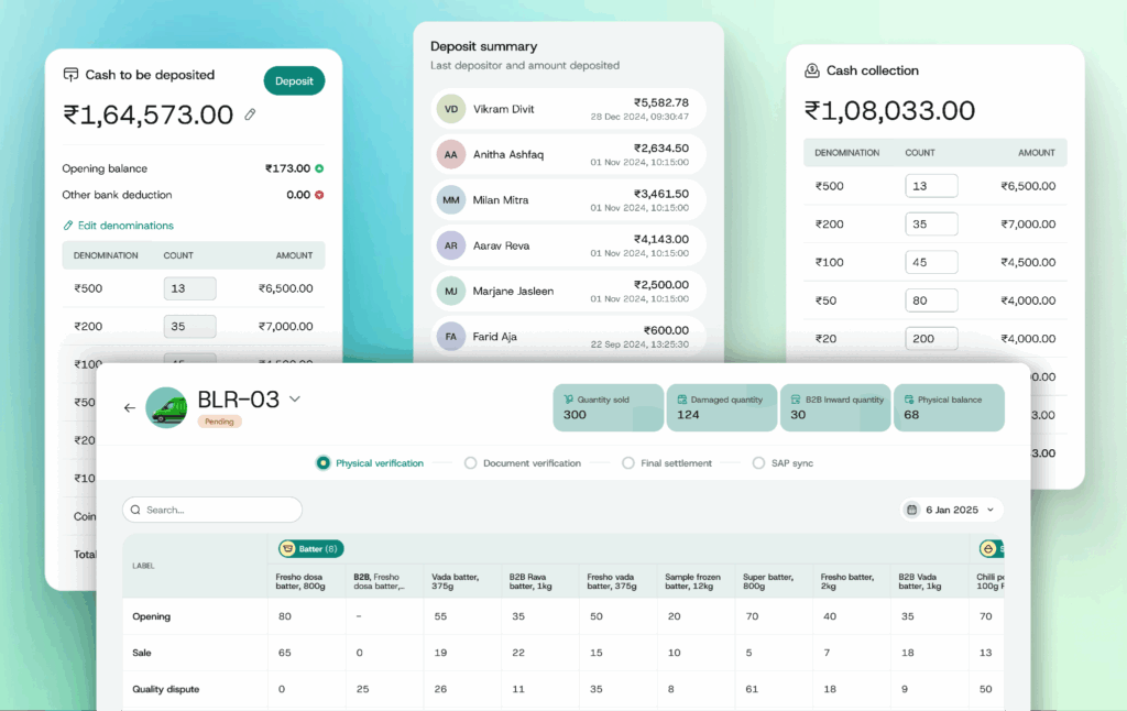
Caption: ID Fresh, Operational dashboard displaying route progress, inventory levels, cash settlements, and field sales activity in a single workspace.
The lesson I took from ID Fresh: operational dashboards fail when designers treat them like analytical tools. The user is not exploring data. They are managing a situation. The design must respect that difference.
PropertyZar: Analytical Dashboard
PropertyZar is a property management platform used by landlords and property managers to track rent collection patterns, occupancy rates, maintenance trends, and lease performance across multiple buildings simultaneously. This is a different design problem from ID Fresh. The volume of data was large. The range of user roles was wider.
The PropertyZar user is not reacting to an alert. They are building a picture. The dashboard needed to support filtering, cross-property comparison, and role-based views. A finance lead sees different defaults than a maintenance coordinator. We built customisable views and dynamic reporting on top of a consistent data hierarchy, so each user landed in the context that was relevant to them.
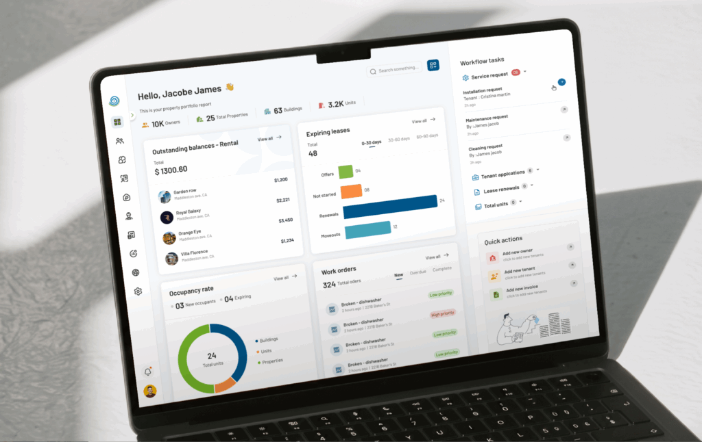
Caption: The PropertyZar dashboard helps property teams compare performance across buildings, uncover trends, and focus on the information that matters to their role.
The lesson I took from PropertyZar: Analytical dashboards need exploration controls. But those controls have to be bound. Unlimited flexibility reads as no guidance at all.
Pepper: Strategic Dashboard
Pepper is an asset management platform. The dashboard was built for executives tracking portfolio growth, deal pipeline movement, investor commitments, and compliance risks. They are reviewed throughout the day; this dashboard was intended for weekly and monthly reviews.
Strategic dashboards have a different time horizon, and that changes almost every design decision. The user is assessing. The design question is redirected to “are we on track, and where is the risk?” Portfolio metrics sat at the top. Deal pipeline and stage movement were in the middle. Drill-down into individual assets is on inner pages, only accessed when a number is prompted with a question.
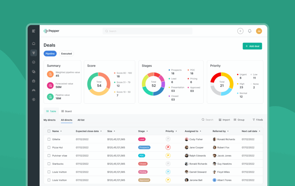
Caption: One glance at the Pepper dashboard tells leaders what is growing, what is slowing down, and where they may need to step in.
The lesson I took from Pepper: Strategic dashboards are designed to create confidence. Their job is to help leaders understand progress, identify risk, and make informed decisions without overwhelming them with operational detail.
The moment you understand which of these three questions the dashboard must answer, many design decisions become significantly clearer. That clarity should be established in the very first conversation with the client.
Take it from me, never skip this lesson!
Real Dashboard Design Examples From Projects I've Worked On
I've handled enough client calls, requirements, and expectation-setting conversations across sectors. Every industry comes with its own users, its own pressures, and its own requirements. What works for a sales manager at 8 am before a pipeline review will completely fail a clinician mid-ward round, right?
Think of it this way: everyone has different tastes, not everyone comes to the table looking for the same meal. Every sector comes to the table with a different bowl and a different appetite. My job is to figure out the recipe.
Let me walk you through a few dashboard design examples from projects I've worked on. Each one was shaped by a different context, a different audience, and a different set of decisions that needed to be made.
#Example 1. Fitreat Couple: Fitness Tracking & Wellness Dashboard
Fitness data is deeply personal, continuous, and surprisingly easy to misread. A user might wake up early, complete their walk, log their meals, track their water intake, and do everything their coach recommends. A week later, they open the app and see plenty of numbers, but still wonder, "Am I actually making progress?" The dashboard needed to connect activity, nutrition, coaching, and progress into one clear story that users, trainers, and nutritionists could all understand.
One thing I noticed during testing was how often users struggled with calorie numbers. They were tracking consistently, but the figures felt abstract and difficult to relate to. We replaced that experience with simple visual indicators that made progress easier to grasp at a glance.
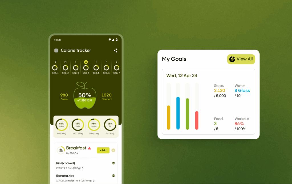
Caption: Instead of overwhelming users with wellness data, the Fitreat dashboard helps them see how far they've come and where to focus next.
Here's the catch: users do not need more wellness data. They need a dashboard that helps them understand where they are, how far they have come, and what they should focus on next.
#Example 2. Bixco: Sales & Business Overview Dashboard
I have worked on enough business and executive dashboards. Sales and business leaders spend a large part of their day making decisions from dashboards. Sometimes it is before a board meeting. Sometimes it is midway through a quarter when targets start slipping, and everyone wants answers. In those moments, nobody has the patience to dig through layers of reports looking for what matters.
Executives had access to a huge amount of business data, but finding the right insight often took more effort than it should have. The dashboard needed to show revenue trends, performance metrics, operational bottlenecks, and strategic opportunities immediately, while still allowing users to explore deeper when necessary.
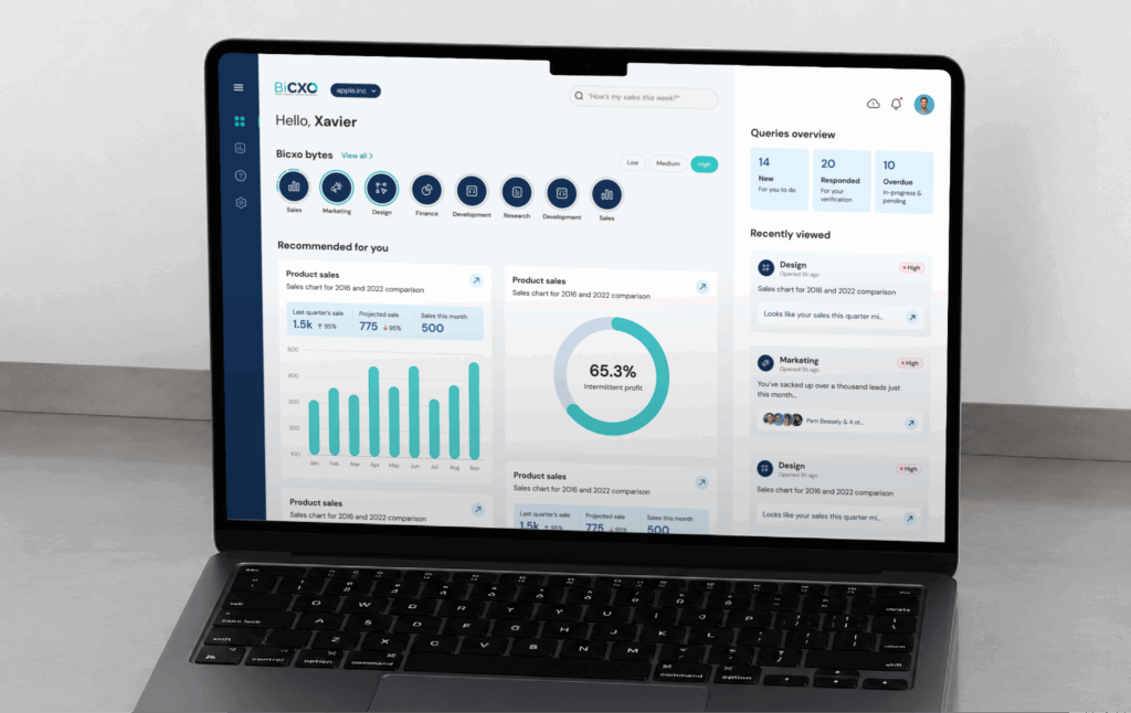
Caption: The Bixco dashboard shows leaders get a clear view of business performance, emerging opportunities, and the actions that matter most.
Here's the catch: executives don't buy dashboards for data. They need faster access to the right context. The dashboard should immediately understand what is happening, where attention is needed, and what decision comes next.
#Example 3. Email Tracker: Email Marketing & Campaign Analytics Dashboard
A marketing manager told me that she spent the first thirty minutes of every Monday morning just trying to understand what happened the previous week. That’s the challenge. The existing tools, including Google Postmaster, showed ample data but no sense of priority. Everything looked equally important.
I recrafted the information hierarchy around a question: What does a marketer need to understand in the first sixty seconds? Critical deliverability signals moved to the forefront. Domain performance became easier to compare. Alerts were designed to surface meaningful issues instead of adding more noise.
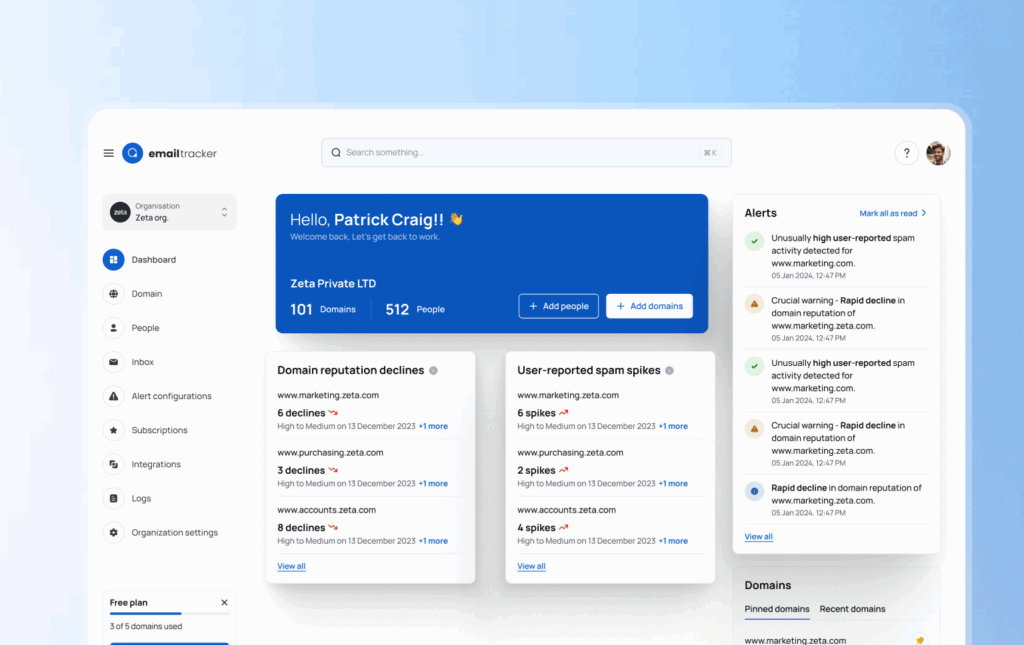
Caption: The Email Tracker dashboard helps marketers spot deliverability issues, prioritize risks, and get answers in minutes instead of hours.
Here's the catch: Users spent less time interpreting reports and more time acting on them. Sometimes the value of a dashboard is not adding more information. It is giving people their time back.
#Example 4. Second Opinion: Healthcare App Dashboard
A doctor opens a dashboard sixty seconds before a consultation to confirm they're looking at the right patient, the right time, and the right status. They needed a clear view of their appointments, upcoming consultations, patient details, and session status the moment they logged in.
I pulled the most critical layer to the surface. Total appointments, completed sessions, and the next patient's name, time, and date are visible the moment the dashboard loads, before a single scroll. Below that, a clean appointment list with status indicators that told the doctor at a glance what was completed, what was waiting, and what needed to be started.
I approach it with meticulous care because every screen ultimately supports a real interaction between a doctor and a patient.
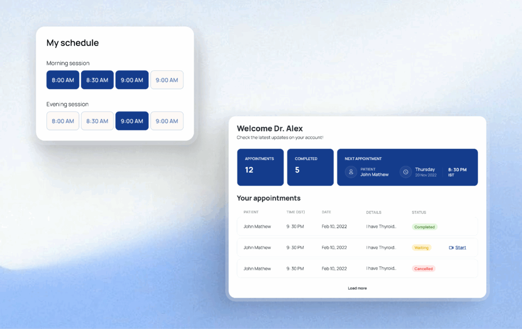
Caption: The Second Opinion dashboard makes the next patient, next appointment, and next action instantly visible, so doctors can stay focused on care instead of clicks.
Here's the catch: A dashboard should help doctors find the information they need instantly, so they can focus their attention on the patient rather than searching through the system.
The Best Dashboard Design Practices I Keep Coming Back To
These aren't universal best dashboard design reformatted for dashboards. These are the specific rules that I repeatedly come up with in my real dashboard projects.
1. Design for the Decision, Not the Data You Have Available
When I first started, I used this technique before framing a single widget, asking one question myself: what decision does this dashboard need to support?
Every metric must trace back to a specific action a real user will take. If it cannot, it does not belong on the primary view.
Before wireframing anything, do a simple exercise: Sit down with the primary users, the actual people who'll open this dashboard every morning, and ask: "What's the one thing you need to know the moment this dashboard loads?" The answers are almost always simpler and more specific than what was originally requested.
This step also forces you to separate vanity metrics from decision metrics. A tool I find useful at this stage is a decision map. It is a document listing each metric, the decision it supports, and who needs it. It takes an hour to build and saves weeks of scope creep later.
2. Design for Roles, Not for Everyone at Once
The mistake I see most often is designing for the most data-literate person in the room and assuming everyone else will adapt. They won't. They'll skim, get confused, and stop trusting the data.
The better approach is role-aware information architecture. Before I start any layout, I define two to four user personas with specific tasks, acceptable complexity levels, and the primary questions they're trying to answer. Then I build views. Or at minimum, a visual priority system around those personas.
3. Treat Layout as a Communication Hierarchy
Always remember this: people don't read screens, they scan them.
While designing the dashboard, I focus on the F-pattern. Eye-tracking research shows users sweep across the top of a screen first, then drift down the left side in progressively shorter horizontal movements. Tableau's research adds a specific finding for dashboards: when the same element repeats across a row, attention is strongest at the first item and falls off from there. This means if you have five KPI cards in a row, most users barely register the last two.
The structure that consistently works across my projects:
- Top row: Three to five KPIs that matter most. large numbers, clear labels, minimal decoration
- Middle section: Trend charts and time series that show direction and momentum
- Bottom section: Granular tables and breakdowns for users who need to dig
Here, for the Bayth Investment Dashboard, you can see I prioritized the most important metrics by displaying key figures prominently at the top, followed by trend analysis to provide performance context. Detailed tables are then used to present comprehensive data breakdowns and support further exploration.
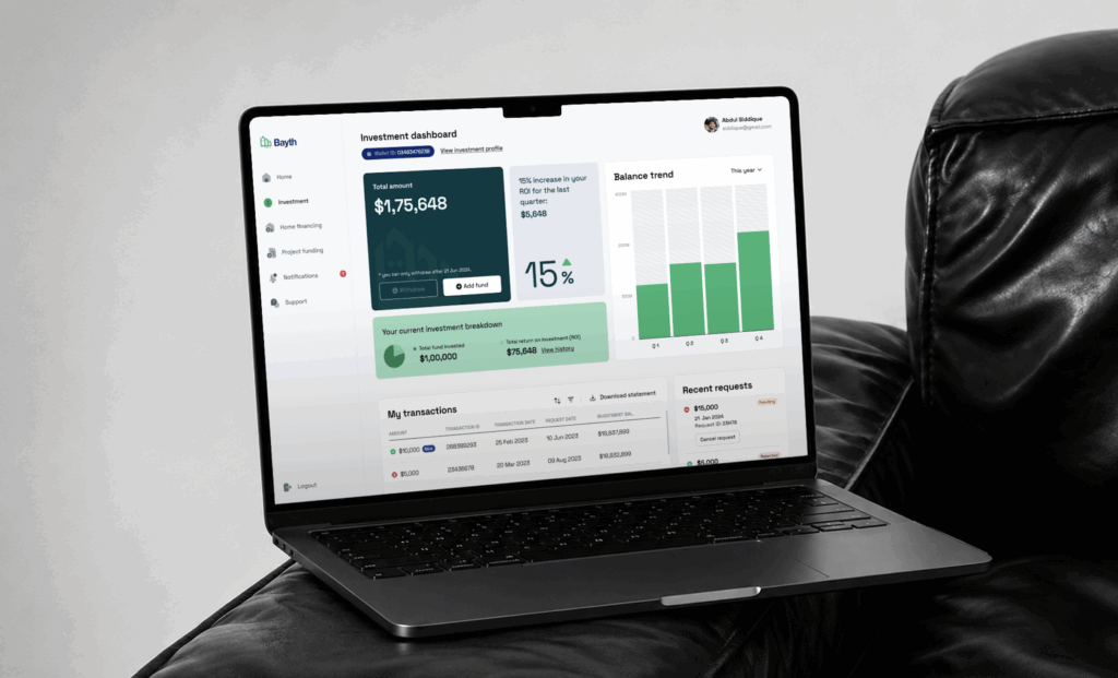
Caption: The Bayth dashboard brings portfolio value, returns, and performance trends into focus, helping investors see the bigger picture before exploring the numbers behind it.
4. Use Psychology to Make the Interface Do the Cognitive Work
One of the best ways to design a dashboard is to apply cognitive science. Three principles in particular shape how I make layout and interaction decisions.
- Fitts's Law: It tells us that the time it takes to interact with data depends on its size and proximity to where attention currently sits. The most important numbers and actions should be the largest and most reachable elements on screen. Don't bury critical controls in corners or hide them behind precision-demanding small icons.
- Hick's Law: It tells us that more choices mean slower decisions. Every filter option, dropdown, and toggle you add to a dashboard increases the cognitive cost of using it. Show only what's essential upfront. Advanced options live behind a toggle that users can reach when they actually need them.
- Gestalt principles: They describe how the brain automatically groups things that are visually close, similar in appearance, or enclosed within the same boundary. When revenue metrics live together, and engagement metrics live together, relationships surface without the user having to work for them.
5. Match Every Chart to the Story It Needs to Tell
Teams choose charts based on what looks interesting rather than what the data is actually saying. A designer finds a radar chart or a Pareto diagram and builds a use case around it. The chart becomes the feature. The user's actual question goes unanswered.
The question I always start with isn't "what looks good here?" It's "what am I trying to say?"
Some pairings that consistently work:
- Line charts for changes over time
- Bar charts for comparison across categories.
- Scatter plots for correlation or distribution between variables
- Single-number cards for current status at an instant glance
To give you an inside look, let me put my project here. For the PersuitLead Dashboard, I used appropriate visualizations such as bar and pie charts to present comparisons. Summary tables highlight important data, while drill-down actions take users to dedicated pages for detailed analysis.
Two things I recommend avoiding entirely: pie charts with more than four slices, and anything rendered in 3D. Both create an impression of sophistication while making the data genuinely harder to read.
There's also a test I run before any chart ships, which I call the hover test. If a user has to hover to understand what they are looking at, the chart has already failed. Labels, axes, and context must be readable without interaction. Tooltips are for depth. They are not a substitute for basic clarity.
6. Give Every Metric Just Enough Context to Be Actionable
A number without context is noise. "Revenue: $142,000" tells a user almost nothing. Is that above the target? Up from last month? Typical for this quarter? Without answers to those questions within the interface, the user has to construct the story themselves, and most will not bother.
Every KPI on a dashboard needs three layers of context:
- Temporal comparison against the previous period
- Target or benchmark showing where performance should be
- Trend indicator, a sparkline, directional arrow, or color status that communicates direction at a glance
The ID Foods Load-Out Planning Dashboard made this concrete for me. Field sales managers were opening this dashboard before routes, between stops, and mid-distribution to check settlement status and stock gaps. They didn't have time to dig. Every primary metric card was built with all three context layers baked in: previous period comparison, target benchmark, and a directional indicator. The judgment call was available the moment the screen loaded.
But there's a limit to how much context belongs on the primary view. The deeper detail lives in drill-down pages structured around intuitive hierarchies: geographic, temporal, and categorical. Summary data loads fast because it's aggregated. Granular data only gets queried when a user deliberately reaches for it.
That is progressive disclosure.
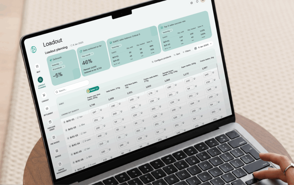
Caption: The ID Foods Load-Out Planning dashboard turns sales targets and load-out performance into instant decisions.
7. Give Users Control, But Define the Boundaries First
Filters and custom views dramatically increase how useful a dashboard is to any given person. A regional manager wants to see their territory. A product lead wants to see their feature. Without filter controls, both are looking at aggregate data that's only partially relevant to either.
The filter controls I build into almost every dashboard:
- Global filters filters for date range, team, and region that update all widgets simultaneously
- Widget-level filters for granular control over specific charts
- Saved presets so users can switch between common views without reconfiguring everything from scratch
8. Design for the States Most Teams Completely Overlook
The three states that reveal whether a dashboard was actually thought through: empty, loading, and error.
- Empty states are the most consistently wasted design moment. When a new user logs in with no data yet, most dashboards display blank cards and hollow chart outlines
In Contracting PLus Umbrella, I handled this deliberately. The dashboard is designed to handle empty states gracefully. First-time users are guided with clear call-to-action buttons to add data. As data becomes available, the empty states automatically transition into the relevant charts and insights.
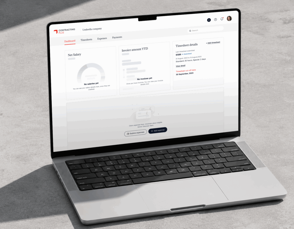
Caption: The Contracting Plus Umbrella dashboard turns empty states into helpful guidance, making the first experience feel simple.
- Loading states should mirror the final layout. Skeleton screens keep users oriented because the structure they see while waiting matches what they will interact with. A spinner in the middle of a blank screen is a trust gap.
- Error states are where most teams completely give up. "Something went wrong" is not an acceptable response. When data fails to load, users need a plain explanation of what happened and a clear path forward, like retry, adjust filters, or escalate. An error handled well goes almost unnoticed. An error left as a vague message breaks trust in the entire product.
9. Measure Whether the Dashboard Actually Works
This is the fun part! Most dashboards ship, get announced, and then gradually stop being used. Without measurement, there is no way to know whether users are succeeding or simply tolerating the interface.
The metric I find most reliable is time on task, how long it takes a real user to find a specific answer in the dashboard. Run this test with representative tasks your users actually perform. Measure it after launch. Measure it again after every significant change. A dashboard that's getting faster to use is improving. One where it stays flat or increases after a redesign is communicating something no internal review would have surfaced.
A simpler version is the five-second test: show someone unfamiliar with the dashboard the interface for five seconds, take it away, and ask what they remember. If they name the most important metric, your hierarchy is working. If they describe the color scheme, your visual design is outrunning your information design.
With these best dashboard design Practices fleshed out, you’re ready to design your dashboard!
Dashboard UI Design: The Visual Layer (And Why It Comes Last)
One misconception I encounter frequently is that dashboard UI design is primarily about colours, charts, typography, and visual polish. But those decisions come much later.
In my experience, dashboard UI design should be the final layer of the design process, not the first. Information hierarchy, user goals, workflows, and decision-making requirements need to be established before a single colour or component enters the conversation.
This is why I am cautious about using inspiration galleries as a design strategy. Many teams begin a dashboard project by collecting references from Dribbble, Behance, or Pinterest. There is nothing wrong with looking at inspiration. I do it too. But the danger is copying a visual pattern without understanding the problem it was originally designed to solve.
Once the information hierarchy is established, UI decisions become much easier.
Colour Should Signal Status, Not Branding
Most clients naturally want to see their brand colours reflected throughout the dashboard. Brand consistency matters, but dashboards are not marketing websites. Colour carries meaning. If green represents healthy performance and red signals risk, those associations should remain consistent throughout the product.
In fact, some of the most effective dashboards I have worked on are largely monochromatic. When everything is colourful, nothing stands out. When colour is used sparingly, users immediately notice what requires attention.
Typography Creates Priority
Typography follows the same principle. Users rarely read dashboards line by line. They scan. They are looking for confirmation, exceptions, trends, or problems. Typography determines how quickly they find the answer.
The KPI that drives decisions should dominate the visual hierarchy. Supporting metrics should step back.
Size, weight, spacing, and contrast should guide attention naturally without requiring users to think about where to look.
Layout Is Communication
Dashboard layouts operate under different constraints from most digital products.
In a marketing website, whitespace creates comfort and supports storytelling. In a dashboard, space is constantly negotiated against information density. Users expect more information per screen.
For example, trend charts almost always deserve more horizontal space because time-series data becomes harder to interpret when compressed. A chart showing twelve months of performance cannot communicate patterns effectively if it is squeezed into a narrow card simply to maintain visual symmetry.
Similarly, three-column layouts can work well for operational dashboards containing large volumes of information. But without clear grouping and hierarchy, they quickly become visually exhausting. Users stop recognising relationships between metrics and start treating the dashboard as a wall of numbers.
When a Table Is Better Than a Chart
The chart-versus-table debate is often framed as a visual decision. It is actually a behavioural one.
My rule is simple: charts are for insight, tables are for investigation.
If the goal is to understand trends, comparisons, movement, or performance at a glance, charts usually perform better. They reduce analysis time and help users recognise patterns quickly.
But when users need to compare detailed records, review multiple data attributes simultaneously, or locate specific information, tables are often the better choice. No chart can replace a well-structured table when precision matters.
In many of the dashboards I design, charts provide the insight while tables provide the evidence.
Ultimately, the role of dashboard UI design is that the dashboard should surface the story first. The deeper analysis can live one level below.
Dashboard Design Inspiration: How to Use It Without Getting Trapped by It
Every dashboard designer looks for inspiration. I do too.
Early in my career, I would occasionally find a chart or layout that looked impressive and immediately start thinking about how to use it. After working on enough dashboard projects, I realised that this is exactly where many designs begin to lose their way. Now I have changed my path. Inspiration comes much later in my process.
Inspiration Should Follow Understanding, Not Replace It
When a new dashboard project comes in, my first focus is understanding the users, their workflows, the decisions they need to make, and the business context behind the data. I spend time studying competitors, reviewing similar products within the industry, understanding reporting standards, and identifying gaps or opportunities. More recently, AI tools have also helped me quickly explore structural directions and generate early concepts.
Only after the research, information architecture, and wireframing are in place do I start looking for dashboard design inspiration.
At that stage, my usual circuit includes Dribbble, Behance, ThemeForest, Pinterest, competitor products, and occasionally public dashboards. But I am rarely looking for charts to copy. I am studying layout patterns, information grouping, navigation structures, filtering approaches, and ways of presenting complex information more clearly.
The Biggest Inspiration Mistake I See
One of the most common mistakes I see is designers finding an interesting chart and then trying to force data into it. They discover a radar chart, spider chart, Pareto diagram, or some visually unusual representation and become excited about using it. The dashboard gradually becomes an exercise in showcasing the chart rather than solving the user's problem.
My strongest recommendation is to focus on the information hierarchy first.
When I analyse a well-designed dashboard, I pay attention to completely different things than most designers.
I look at:
- What information appears first?
- What receives the most visual emphasis?
- How are related metrics grouped?
- What is the user's likely path through the screen?
- How does the dashboard move from observation to action?
Those decisions are far more valuable than any visual treatment.
Colours, icons, and visual treatments can always be changed. Information hierarchy is much harder to get right because it reflects an understanding of user priorities and business goals.
Learn from Practitioners Who Think Deeply About Information
One source I consistently recommend studying is Nick Desbarats' work on data visualization and dashboard communication. His work stands out for its relentless focus on clarity. He focuses on information hierarchy, chart selection, data storytelling, and how users interpret information inside dashboards.
Studying practitioners like this helps you fathom the visual layer of a dashboard. You start paying attention to how information is prioritised, how metrics are grouped, how context is presented, and how users move from insight to action.
That is where meaningful dashboard design inspiration comes from. Those principles remain relevant regardless of industry, audience, or visual style.
The Cross-Functional Reality: When Stakeholders, Developers & Data All Have Opinions
There are no isolated design decisions in dashboard UX design. Every dashboard sits at the intersection of users, business stakeholders, developers, timelines, budgets, and data constraints.
So, before you start cranking out dashboards, an amicable review should be done with all of them. I realised later in my career.
The Lesson Developers Taught Me
Looking back now, I'm getting this to tell you. Early in my practice, I used to push back on technical constraints. After a few conversations with different developers, I understood that the limitations are business considerations behind every implementation decision. It depends on how much a customer is willing to invest in a chart component and how quickly the product needs to reach the market.
Most dashboards today are built on established chart libraries such as Chart.js, Highcharts, and similar frameworks. These libraries provide ready-made visual foundations that developers configure and extend based on requirements. When a design aligns with what these libraries already support, implementation is efficient and predictable. When it moves outside those capabilities, development effort increases, along with build time and delivery cost.
Also, I learned that every custom visual choice carries a practical trade-off. It directly affects effort, timelines, and product feasibility.
If a designer builds within the structure of existing libraries, the probability of smooth developer alignment is high. If the design moves away from those structures, additional evaluation is required to understand effort versus value.
The Rules I Design By
- Design for the decision the user needs to make, not the data you have available.
- The most important metric earns the most visual weight. That is a hierarchy decision.
- A metric without direction is incomplete. Always show trend context alongside point-in-time numbers.
- Status indicators tell users where to look. Trend lines tell them what to think. A well-designed dashboard needs both to work together.
- The top of the dashboard belongs to the 3-second scan. Supporting details belong in inner pages.
- Design for the user with 30 seconds before a call. The demo scenario takes care of itself.
- Every dashboard carries invisible assumptions like date ranges, exclusions, and data freshness windows. Surface them in the UI. Transparency is part of the design.
Your Next Dashboard Review Starts Here
The next time a stakeholder points at a KPI tile and says, "Can we make that number bigger?" pause before you resize anything. Ask instead: bigger for whom, and in what decision?
That one question reframes the entire conversation. It moves the room from aesthetics to intent, from preference to purpose. And it is usually where the real dashboard design work begins.
If your team is building a dashboard and that conversation keeps stalling, we have worked through it across fintech, operations, and enterprise platforms. See how we approach it.
Explore our Dashboard Design Services
Most dashboards show data. The best ones drive decisions. If yours is doing the former when it should be doing the latter, that is a design problem worth solving. Talk to us and let us build a dashboard your team actually relies on.
🔔Follow Aufait UX on LinkedIn for strategic insights grounded in real-world product outcomes.
Disclaimer: All images belong to the rightful owners!
FAQs: Dashboard Designs
The best dashboard design prioritizes a strict visual hierarchy patterned after natural eye-scanning habits, such as the F- or Z-pattern. Place high-impact, decision-critical KPIs in the top-left area, position comparative trends or charts in the center, and locate deep-dive tables and global filters at the bottom or sides.
Position global filters in a highly visible, fixed top header or a dedicated left sidebar to avoid user confusion. Always include explicit breadcrumbs or visual tags showing currently applied filters so users never misinterpret the data displayed on the screen.
Absolutely. The best dashboard UI design platforms treat the AI's initial layout as a highly editable starting point rather than a final, locked image. Once the AI generates the core structure, you can manually override chart types, adjust color palettes for visual hierarchy, fine-tune specific global filters, or use chat commands to alter individual widgets.
Color should be used as an intentional communication tool rather than a decorative element. Use muted, neutral tones for the core dashboard layout and save high-contrast, bright colors exclusively for critical alerts or status changes, ensuring these color meanings remain consistent across all screens.
Platforms like Stripe and Google Analytics 4 serve as excellent dashboard design examples because they successfully align information depth with specific user roles. They master clean typography, intuitive date-range toggles, and seamless navigation that makes complex data digestible.
While ChatGPT cannot host a live, real-time data connection directly within its chat window, it can build the entire functional framework of a dashboard. By uploading a dataset, you can prompt ChatGPT to analyze the data and instantly output fully interactive dashboard prototypes using single-file HTML/JavaScript (Chart.js), Python (Streamlit), or step-by-step macro code for Microsoft Excel and Tableau.
Traditional dashboards use fixed, hardcoded layouts that look identical for every single user. Generative UI flips this script by using AI to assemble and render the user interface dynamically in real time. Based on a user's role, past actions, and immediate goal, the AI instantly customizes layout density, chart types, and widgets to show exactly what they need at that precise moment.
Consumer AI models generate static image mockups or basic frontend code containing dummy data that is ideal for fast UI prototyping. Conversely, dedicated enterprise AI engines connect directly to live data warehouses (like Snowflake or BigQuery) while strictly enforcing row-level security and existing data governance rules to ensure numbers stay 100% accurate.
While conversational AI engines are excellent at answering targeted business questions (e.g., "Why did churn spike last Tuesday?"), they cannot replace the human cognitive speed of scanning a well-designed chart. The best dashboard design practices integrate both worlds: using AI to proactively surface anomalies and plain-English insights, while utilizing a clean dashboard layout to map out macro trends and provide visual validation.
Intelligent dashboard design leverages AI to mitigate heavy server queries by avoiding loading dozens of complex widgets simultaneously. By organizing modular layouts where complex computational widgets remain hidden behind automated narrative summaries, accordions, or explicit chat triggers, initial API payload sizes drop significantly.
Table of Contents
Stop Staring at hideous Data. Start Driving Decisions.
Don't let valuable insights get buried under a wall of numbers.
Get a Free Dashboard UX Audit