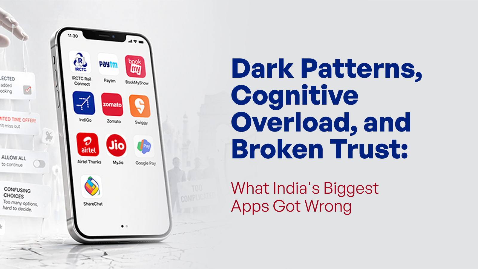
Dark Patterns, Cognitive Overload, and Broken Trust: What India’s Biggest Apps Got Wrong
A discerning, constructive examination of the design inadequacies that frustrate nearly 900 million Indian users each day, and the role of strategic design thinking required to remedy them.
Summary
India's most-used apps, IRCTC, Paytm, Zomato, IndiGo, and others share one costly flaw: they were designed around business targets rather than real user needs. The result is hidden charges, manipulative buttons, cluttered screens, and interfaces that ignore a billion linguistically diverse people. This blog unpacks exactly where they went wrong, why it's hurting user trust, and what a genuinely user-first design looks like instead.
India has 886 million active internet users. And yet if you sit with a fraction of those users and watch them navigate the apps they open every single day, you see hesitation. Workarounds. A practiced frustration that never makes them get into an App Store review. It absolutely makes it into the decision to uninstall or just give up. This pattern can be traced to a strategy that, over time, lost sight of the user, leading to recurring common UX mistakes and, in some cases, the presence of dark patterns in UX design that prioritise business outcomes over user clarity.
The Reality Check: What India’s Digital Landscape Actually Looks Like
Let me put the scale of this in perspective.
- The Advertising Standards Council of India “Conscious Patterns” report (2024) analysed 12,000+ screens across 53 top Indian apps and found that 52 of them used at least one deceptive design pattern, covering 98% of the most-downloaded apps in the country.
- Together, these apps account for over 21 billion downloads, making consumer exposure to manipulative design, as the Advertising Standards Council of India (ASCI) describes it, “mind-boggling.”
The Internet and Mobile Association of India–Kantar “Internet in India 2024” report shows:
- 55% of internet users are from rural India
- 57% of urban users prefer consuming content in regional languages
- Regional languages dominate overall digital consumption
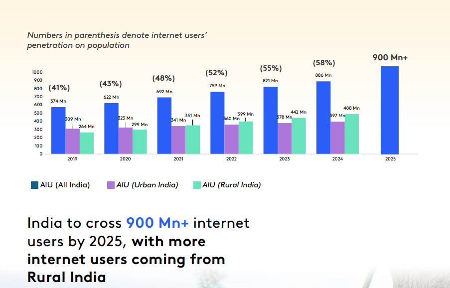
Caption: With India’s internet user base crossing 900 million, the majority of digital growth is now driven by rural markets and regional language speakers.
Tamil, Telugu, and Malayalam speakers form a significant share of this digital ecosystem.
And yet, most apps continue to be designed as if their entire audience graduated from an English-medium college and lives within delivery range of a tier-1 city Starbucks.
My working rule, after a year inside UX rooms:
If the first question your design team asks is “how do we increase conversions?” rather than “what is the user trying to accomplish right now?”, the UX is already compromised. Every mistake that follows can be traced back to this inversion of priorities.
#1. IRCTC’s Cognitive Overload Problem: Designing for the Government, Not the Traveller
Every Indian who has tried to book a Tatkal ticket knows the specific kind of dread that comes with opening IRCTC at 9:58 AM. A Business Standard report from November 2024 documented 222 simultaneous complaints within a single hour during a peak booking window. It's the interface itself, one of the more visible bad UX design examples at scale.
Documented UX Issue:
The IRCTC homepage and booking form present seat class, quota type, boarding point options, and travel date filters, all at once, before the user has selected their train.
A UX case study analysing the app's design principles found that this causes decision paralysis: users abandon the process mid-way because they don't know which filter to look at first. The captcha at login, still active as of 2025, is another barrier that contributes to session drop-offs on a 10-second Tatkal window.
The core strategic mistake here is an information architecture decision baked into the product roadmap: IRCTC has tried to surface every possible option to every user on the first screen. This is what happens when a system is designed around a checklist of features rather than a clear, sequential user journey.
What Designers Could Do Instead
- Apply progressive disclosure
Start with one clear question: Where are you going, and when?
Reveal quota, class, and boarding options only when they become relevant. - Reduce repeat friction
Introduce robust saved passenger profiles so frequent users don’t re-enter the same data repeatedly. - Design for peak reality
Invest in load-tested microservices and resilient backend systems so the interface remains usable during high-demand windows.
Aufait UX in Practice
IUDX: Simplifying Smart Cities Data Exchange in India
IRCTC's problem is too much information, no clear hierarchy; it's the defining challenge of every data-heavy government platform in India. We encountered an almost identical architecture crisis when we became design partners for IUDX, a data exchange platform built under the Smart Cities Mission. IUDX exists to facilitate the intelligent sharing and use of datasets across Indian cities, critical infrastructure for urban governance. But when we came on board, the platform carried hundreds of datasets, multiple user types, and no clear navigational logic binding them together.
Our Design Approach
We redesigned the homepage as the first orientation point for both user types, introducing clear domain categorization at the entry level so users could navigate by city or by data type. For each city, we built a dedicated city home page: a contextual landing that surfaces only the relevant datasets and KPIs for that urban context. The portal was redesigned around a dashboard architecture with graphical KPI representation, replacing raw data tables with visual analytics. Listing views were streamlined with purposeful filter logic and record density suited to how each user type searches. Navigation depth was reduced throughout, fewer clicks, clearer wayfinding, and no dead ends.
Critically, we extended responsive design across the website and portal so users could access the platform on any device, a necessity in a country where most government data workers are mobile-first.
The strategic lesson IUDX reinforced for us, and that IRCTC has yet to apply, is that information architecture is a product strategy decision.
#2. Paytm’s Search Bar for Its Own Features Is an Admission of Failure
There's a design rule that should be common knowledge by now: if users need a search bar to find features inside your app, your navigation is broken. A search bar is for finding content in a database, such as news articles, products, and transactions. It is not for finding the button that lets you pay your electricity bill in an app specifically designed for that purpose.
Documented UX Issue
A comprehensive Medium case study on Paytm’s UX, backed by a survey of 32 regular UPI users, highlights consistent navigation friction. Paytm, launched in 2010 as a mobile recharge platform, has expanded into payments, banking, insurance, ticketing, and more.
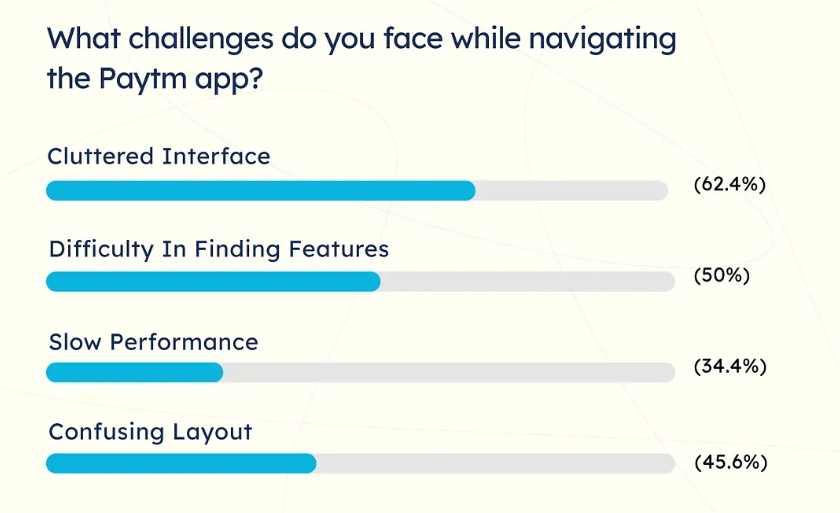
Caption: A user sentiment survey reveals that over 62% of users struggle with Paytm’s cluttered interface.
The “Recharges and Bill Payments” screen uses a segmented control with 14 options. A UI pattern that usability guidelines recommend a maximum of 4–5 for clarity. The home screen carries dense feature blocks, making it difficult to scan or act quickly. The presence of a search bar for internal navigation reflects this overload and points to common UX mistakes in structuring large feature ecosystems.
Competitors like PhonePe and Google Pay operate on the same UPI infrastructure from the National Payments Corporation of India. They won on simplicity. Their home screens ask you to do one of two things: pay or receive. That's a strategic UX decision.
What Designers Could Do Instead
- Prioritise based on actual usage
Identify the small set of features that drive most sessions. Give them primary visibility. Move secondary services into a structured “More” section. - Build a clear information hierarchy
Organise features based on user intent, not internal categories. Reduce visual density. Limit primary navigation choices. - Introduce usage-based personalization
Surface frequent actions early. If a user repeatedly recharges the same number, bring that action to the home screen within a few sessions.
Aufait UX in Practice
City of Johannesburg (COJ): Designing a Unified Citizen Experience for Urban Services
The same fragmentation seen in Paytm is reflected in the city’s civic infrastructure. That was the brief we received from the City of Johannesburg (COJ).
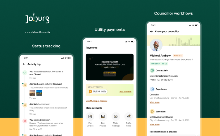
The Design Challenge
The COJ app serves two distinct user groups with very different needs on the same platform: residents and ward councillors. When a resident spots a burst pipe, a road collapse, or a power outage, they need a fast, low-friction way to report it and then track whether it's been fixed. When a councillor receives that report, they need to be able to action it, escalate it, and communicate back. Meanwhile, the same resident who files a civic complaint also needs to pay their electricity and water bill, both of which in Johannesburg flow through the city's systems, unlike in India, where KSEB, the water board, and municipal services each maintain entirely separate payment portals across separate websites with no unified view.
Our Design Approach
We designed a single, unified mobile experience that consolidated civic reporting, utility payments, and service request tracking into one structured interface. Issue reporting was simplified: capture, tag location, categorize, and submit within seconds
- Status tracking was made transparent: logged, assigned, in progress, resolved
- Utility payments were structured into a single view with clear balances and history
- Councillor workflows were streamlined for action, escalation, and communication
The design accounted for varied digital literacy, inconsistent connectivity, and both urgent and routine usage scenarios.
#3. BookMyShow’s Basket Sneaking: When a “Feature” Becomes a Regulatory Case
In February 2025, the Central Consumer Protection Authority (CCPA) issued a formal notice to BookMyShow for "Basket Sneaking," a widely cited example in discussions around dark patterns in UX design. After a user selected movie tickets, ₹1 per ticket was automatically added as a contribution to BookMyShow's "BookASmile" charity initiative, enabled via a pre-ticked checkbox that most users never noticed.
Regulatory Action: Dark Pattern
BookMyShow was found in violation of Clause 2 of Annexure 1 of the CCPA's Guidelines for Prevention and Regulation of Dark Patterns UX (November 2023) / 22 DEC 2024, by Press Information Bureau (PIB) Delhi. Following the notice, the platform updated its interface to provide a clear, voluntary opt-in for the donation.
A LocalCircles survey covering 22,000+ respondents across 296 districts reported:
- 73% users experienced basket sneaking
- 80% encountered hidden charges not disclosed upfront
- 62% felt pressured by false urgency during booking
The Advertising Standards Council of India (ASCI) "Conscious Patterns" report identified drip pricing as present in 43% of the 53 top Indian apps analysed. BookMyShow, PVR, and Paytm Insider were all flagged for basket sneaking and drip pricing.
Impact on User Trust
This is strategically self-defeating. Trust, once broken, generates word-of-mouth that no advertising budget can reverse. The users who feel tricked don't write a formal complaint; they tell their friends, post on X (formerly Twitter), and shift to alternatives for the next booking.
What Designers Could Do Instead
- Display full pricing upfront
Show the total cost, including all fees, at the search stage. - Use explicit, voluntary consent
Remove pre-selected options for add-ons and contributions. - Design meaningful opt-in moments
Place charitable contributions after booking with a clear, positive prompt. - Maintain pricing consistency
Avoid incremental fee disclosure across steps.
#4. IndiGo’s “No, I Will Take Risk” Button: Confirm Shaming as a Business Strategy
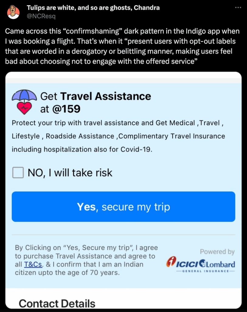
Caption: A viral example of "confirm shaming" on the IndiGo app, where the interface uses guilt-driven copy to manipulate user behavior, a dark pattern that sacrifices long-term trust for short-term conversion.
When a passenger tried to decline paid seat selection on the IndiGo 6E app, the interface presented a button that read: “No, I will take risk.” This is a textbook example of dark patterns in UX design, specifically confirm shaming, a UI design technique that uses guilt, fear, or mockery to manipulate users into choosing an option they didn't want.
Regulatory Action: CCPA Order June 2024
The CCPA issued a formal order to IndiGo Airlines on June 19, 2024, citing two dark patterns: Confirm Shaming (the "I will take risk" button) and an opaque seat assignment process that obscured the option to skip paid seat selection entirely. Following the order, IndiGo updated its interface to clearly state: "You can skip preferred seat selection and complete your booking. IndiGo will auto-assign a seat prior to your travel."
The fascinating state about this case is that someone on IndiGo's product team deliberately wrote that copy. Someone reviewed it. Someone approved it for production. This didn't happen by accident; it was a conversion optimization decision. The thinking, presumably, if we make users feel foolish for declining, more will buy. But the user on the receiving end of "No, I will take risk" doesn't feel nudged. They feel mocked. And they remember it.
What Designers Could Do Instead
- Use neutral, direct copy
“Skip seat selection; IndiGo will assign a seat for free.” - Make options equally visible
Present opt-in and opt-out choices without bias. - Strengthen the value of upgrades
Use seat maps and clear benefits to support paid selection. - Ensure flow consistency
Align booking, seat selection, and check-in states without a mismatch.
#5. Zomato and Swiggy’s Drip Pricing: The Price You See Is Not the Price You Pay
You open the app and see a biryani listed at ₹249. You add it to the cart. By checkout, the total is ₹349, sometimes ₹380. Platform fee, delivery charge, rain surge, GST, each revealed one layer at a time, accumulating as your hunger clouds your judgment. This is drip pricing, and it is among the most documented dark patterns in UX design in Indian food delivery.
Regulatory Context: CCPA & ASCI 2024
Both Zomato and Swiggy have faced regulatory scrutiny for false urgency (countdown timers) and hidden charges, including "platform fees" during checkout. The CCPA issued a suo motu notice against Swiggy for alleged deficiency in service and unfair trade practice (Case No. CPA/2/31/2024).
The ASCI "Conscious Patterns" report identified drip pricing in 43% of the top apps analysed, with delivery apps among the worst offenders. Both platforms have since submitted self-audit declarations of compliance with the 2023 CCPA Dark Pattern Guidelines, though independent monitoring continues.
I want to be fair here. Zomato and Swiggy operate on famously thin margins. Delivery logistics in India, across traffic, weather, and geography, are genuinely expensive. The platform fee and delivery charge exist for real operational reasons. The problem is the strategy of hiding them until the user has already committed emotional energy to the purchase decision.
Brand Experience Gap
The irony is that Zomato's own brand voice is witty, irreverent, and deeply invested in user love. Their social media team is exceptional. And then their checkout flow does something that directly contradicts the brand promise. That's a strategic misalignment that no amount of clever copy can repair.
What Designers Could Do Instead
- Show the total cost early
Display delivery and platform fees on the restaurant listing screen. - Use real-time price updates
Maintain a persistent total in the cart that updates as items are added. - Remove staged price disclosure
Avoid introducing new charges only at checkout. - Limit artificial urgency
Use time indicators only when they reflect actual constraints.
Aufait UX in Practice
SkyAIO: Modernising the UAE's Neighbourhood Grocery Experience Without Hiding a Single Number
The drip pricing problem Zomato and Swiggy struggle with is a product decision. With SkyAIO, we chose a different path from the start.
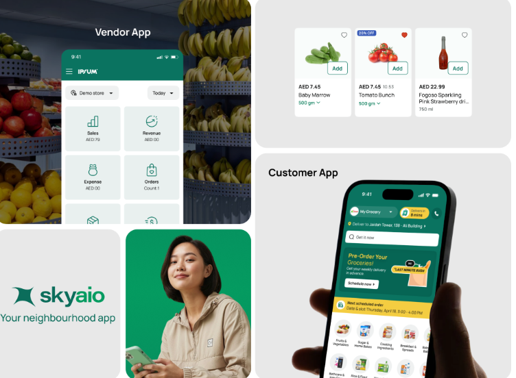
The UAE's baqala ecosystem, the network of small, hyperlocal neighbourhood grocery stores that form the backbone of everyday shopping for millions of residents, had been running on WhatsApp orders and handwritten paper bills for years. These were trusted, community-embedded businesses. They just needed modern infrastructure that respected that trust and extended it into a digital experience.
The Design Challenge
SkyAIO serves two users at once:
- Customers who want to discover stores, browse products, place orders, and track delivery
- Store owners who need structured order management without losing their personal, familiar workflow
The platform needed to simplify operations while preserving the trust and clarity expected in neighbourhood commerce.
Our Design Approach
From the very first design decision, we established a non-negotiable constraint:
- No hidden charges, no manipulative flows, no misleading pricing at any stage of the journey.
- Product pricing, delivery details, and availability are surfaced clearly at the point of discovery. In a hyperlocal commerce environment built on neighbourhood trust, a single instance of a user feeling deceived by a fee they didn't see coming destroys something that took years to build. The baqala owner's reputation lives in that transaction.
#6. Airtel Thanks, MyJio: OTP Fatigue and Authentication Overload
India is, for better or worse, the OTP capital of the world. We verify everything with a six-digit code, logging in, changing a plan, checking a bill, and sometimes even viewing your own account details. There's a reasonable security argument for this. But somewhere between "reasonable security" and "forced re-verification for checking your data balance," the experience collapses entirely. And in late 2024, it became a regulatory crisis that took down OTP delivery for millions of users across the country, and it is one of the more systemic common UX mistakes in authentication design.
Regulatory Event: TRAI OTP Traceability Mandate, December 2024
India's Telecom Regulatory Authority (TRAI) issued a final compliance deadline for all telecom operators, such as Jio, Airtel, and Vodafone-Idea, to implement end-to-end traceability on commercial SMS messages, including OTPs. The mandate was designed to combat fraudulent and spam messages.
The original deadline of November 1, 2024, was pushed twice after Jio, Airtel, and Vi raised concerns that many Principal Entities (banks, e-commerce platforms, fintech apps) had not yet registered their message templates with DLT portals. The final deadline was extended to December 31, 2024. During this transition window, widespread OTP delivery failures were reported, affecting banking logins, e-commerce checkouts, and app authentications across millions of users.
But even outside this regulatory window, the everyday OTP experience in apps like Airtel Thanks and Jio is a consistent friction point. Peak hours create SMS gateway bottlenecks. Festive sale periods and UPI transaction surges routinely cause routing delays across all three major carriers.
Airtel itself acknowledged in late 2024 that its AI spam detection had flagged approximately 6% of all calls on its network and 2% of all SMSes, and the filtering systems, however necessary, have at times incorrectly flagged legitimate transactional OTPs.
User Behaviour Impact
The deeper design failure here is strategic. Security has been treated as a checkpoint that happens at maximum friction regardless of context, rather than as an experience layer that scales its verification demands to the actual risk of the action. Checking your remaining data balance on Jio does not carry the same risk profile as initiating a ₹50,000 bank transfer. Yet many apps apply the same OTP wall to both, an approach that reflects poor prioritisation in user interface design. This is what happens when security requirements are handed to developers as a compliance mandate, with no UX designer in the room asking: "Does this level of friction match the actual risk at this moment?"
What Designers Could Do Instead
- Use adaptive authentication
Match verification level to action risk. Use session persistence or PIN for low-risk actions. - Introduce fallback mechanisms
Provide alternatives such as call-based OTP or authenticator-based codes. - Add delivery status feedback
Show real-time OTP status and expected delay within the interface. - Reduce unnecessary re-verification
Avoid repeated OTP prompts within active sessions.
#7. Google Pay, ShareChat: Vernacular UX That Doesn’t Understand Context
India speaks in 22 official languages, 122 major languages, and over 6,000 dialects. When apps "support" regional languages, what most of them do is translate. They take English strings, run them through a localization pipeline, and ship, and it is one of the more understated yet pervasive UX flaws in large-scale mobile app UX design.
A Telugu-speaking user in Vizag tries to confirm a payment on Google Pay and encounters a phrase so formally translated that it reads like government legalese rather than how a transaction confirmation sounds in their head, in their language, in their life.
Research Finding: IAMAI-Nielsen 2024 & ShareChat Platform Data
Data from the Internet and Mobile Association of India–Nielsen study shows:
- 68% of Indian internet users prefer content in their native language
- Around 350 million users are comfortable with English, while the majority prefer regional languages
ShareChat built its platform around this reality:
- Reported 35% higher engagement compared to English-first platforms
- Over 90% of users consume content in local languages
- More than 50% of users initially selected English during onboarding, not due to comfort, but aspiration
What’s Actually Going Wrong
Google Pay released Hinglish support and regional language options, including Bengali, Gujarati, Kannada, Tamil, Telugu, and Marathi. But language availability and language usability are different things. When a UPI transaction confirmation asks users to verify details using a formally translated copy that doesn't match how people speak about money in those languages, the added language becomes a source of confusion rather than clarity.
A 2023 RBI compliance study found that regional banks that adopted multi-dialect, colloquially written interfaces saw a 57% reduction in customer complaints because the language changed.
Google India's own research shows that over 28% of all searches in India are now voice-based, and the overwhelming majority are conducted in native languages. Users are navigating digital India in their mother tongue. The apps that still require them to switch mental modes to interact with an interface are creating invisible friction that erodes engagement one session at a time.
What Designers Could Do Instead
- Design for colloquial language
Use phrasing that reflects everyday speech rather than a formal translation. - Test with real regional users
Conduct usability testing in target languages with users from tier-2 and tier-3 cities. - Prioritise language in onboarding
Make language selection the first decision. - Adapt iconography to context
Validate whether visual cues align with local understanding. - Build flexible layouts
Support longer text in scripts like Malayalam and Tamil without breaking UI.
Aufait UX in Practice
Designing Vernacular-First: Ethnographic Research in Tier 3–4 India Taught Us About Who Is Holding the Phone
Most vernacular UX research in India is conducted at a desk. We took our designers into the field, into Tier 3 and Tier 4 Indian cities and conducted real ethnographic research with rural audiences in their homes, their shops, and their community spaces.
We designed the experience with vernacular-first principles:
- Language-first onboarding: Users select their preferred language at the start, with scripts visible in their native form. The interface adapts immediately.
- Multi-sensory interaction design: The experience combines audio, visual, and linguistic cues to support understanding beyond text.
- Voice-enabled usability: Integrated text-to-speech and speech-to-text to support users who are more comfortable speaking than typing.
- Colloquial language design: Content is written in everyday speech.
- Flexible, language-aware UI: Layouts adapt to different scripts and character lengths without breaking structure.
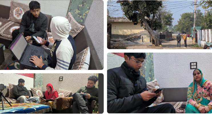
Caption: Aufait UX designers conducting ethnographic field research in Tier 3 and 4 India to capture the authentic workflows and digital pain points of users in their local environments.
The Pattern Beneath the Patterns
If you read through all seven of these, a clear pattern pops into your mind that these are not isolated design failures. In each case, a design decision that harmed users was made because someone upstream, a product manager, a business stakeholder, or a growth lead, set a target that the design optimized toward, at the expense of the person using the product. This is where many common UX mistakes and dark patterns in UX design begin.
India's 900 million users are becoming more aware, more vocal, and more willing to switch. The apps that invest in honest, inclusive, and contextually intelligent mobile app UX design now are building moats that no growth hack can replicate.
From where I sit in Kerala, watching this unfold, I see a market that is still being designed too narrowly. A billion-user ecosystem is being approached as if it serves a small, urban, English-speaking segment. The designers and strategists who treat Indian users with the sophistication those users deserve will define the next decade of this market.
Let’s Rethink What UX Needs to Do in India
At Aufait UX, a UI UX design company in India, we work with teams across sectors to bring strategy and design into alignment so products earn trust instead of engineering it. If your app serves India, it deserves a UX built for India's actual users.
Explore Our UX Design Services
No vanity metrics. No patchwork fixes. Just focused, strategic UX that improves conversion, retention, and trust at scale.
👉 Connect with us to turn your UX into a competitive advantage in India’s next wave of digital growth.
🔔Follow Aufait UX on LinkedIn for strategic insights grounded in real-world product outcomes.
Disclaimer: All the images belong to their respective owners.
FAQs:
This reflects a widespread mobile app usability issue known as OTP fatigue. While security requirements and mandates from the Telecom Regulatory Authority of India have driven stricter verification, many apps rely on a one-size-fits-all approach. In effective mobile app UX design, security should be adaptive. Low-risk actions, such as checking a balance, should involve minimal friction, while high-risk actions, such as fund transfers, can warrant stronger authentication. This approach improves the user journey without compromising safety.
In mobile app design, simple translation of English text into regional languages often leads to poor comprehension and becomes a bad UI design example. Effective vernacular UX is transcreation, using natural, conversational language that reflects how people actually speak. Strong user interface design in this context also includes voice-enabled navigation and multi-sensory cues such as audio and visual guidance. Designing for real usage conditions in Tier 3 and Tier 4 cities ensures the product aligns with cultural context and varying levels of digital literacy.
Many apps use Forced Action (mandatory sign-up walls) to inflate user acquisition metrics before providing any value. However, 2026 UX research shows that guest access and delayed onboarding lead to 35% higher long-term retention, as users are more likely to share data after the app has earned their trust through a successful first interaction.
Interface Interference is a dark patterns UX tactic where a design highlights a preferred (often higher-cost) action while downplaying or hiding the standard option. In Indian e-commerce, this shows up as oversized premium buttons, misleading defaults, or buried conditions for free shipping, classic bad UI design examples that disrupt decision-making. The impact is that users feel nudged rather than guided, leading to confusion, abandoned carts, and erosion of trust.
Dark patterns in UX design, such as basket sneaking and drip pricing, may lift short-term conversions, but they erode the one thing LTV depends on: user trust. When users feel misled, they are far more likely to switch to competitors, abandon the product, and share negative feedback, making this one of the most costly UX design mistakes in the long run. Ethical, transparent mobile app UX design is a retention strategy that sustains LTV and protects the brand from both reputational damage and regulatory risk.
Table of Contents
Is Your App Cultivating Trust or Merely Chasing Conversions?
Eliminate friction. Elevate experience
Let’s Audit