Power BI Dashboard UI/UX Design Best Practices
The difference between noise and actionable insight lies in the design of your dashboard—are you ready to turn your numbers into narratives with Power BI?
In today’s data-saturated world, the real value of data lies in what you do with it. Data is everywhere, powering analytics, driving strategies, and informing decisions. But here’s the catch: no matter how rich your data is, its value hinges on how effectively it’s presented and understood. That’s where Power BI steps in. Following Power BI dashboard design best practices ensures that data is structured, prioritised, and visualised in ways that support real business decisions.
Microsoft’s premier business analytics tool transforms raw numbers into meaningful, interactive visuals. However, the potential of Power BI designs comes from its powerful features, combined with the thoughtful design of its dashboards.
A poorly designed dashboard can confuse users, obscure insights, and hinder decision-making. On the other hand, a well-crafted dashboard simplifies complex data and drives impactful decisions, and achieves business objectives.
This article unveils the top 10 practical Power BI dashboard design tips and dashboard UX design principles that will help you build clearer, more effective dashboards. Whether you’re a business leader seeking clarity, an analyst looking for better ways to tell data stories, or a designer striving for impeccable Power BI UI design guidelines, these dashboard UI/UX design principles will guide you to success.
Power BI Dashboard UI/UX Design Best Practices
1. Understand the Business Context and Audience
Every dashboard begins with a fundamental question: Who is this for, and what decisions will it support? Understanding the audience’s needs and the business context ensures your Power BI designs are relevant and actionable.
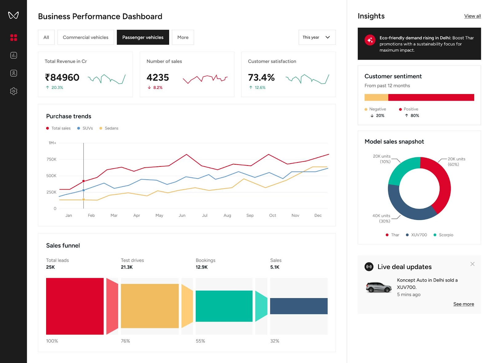
For a leading automotive manufacturer, we designed dashboards with Microsoft Power BI that gave executives insights into sales trends, dealer performance, and customer sentiment. The client needed clear, actionable data to make informed decisions quickly. By tailoring dashboards to their roles—executives, sales managers, and operational leaders—we ensured the visuals addressed their specific objectives.
Read more about the story here.
Key Considerations
- Executive Dashboards: Focus on high-level KPIs like revenue growth, profit margins, or customer satisfaction trends. Keep visualizations concise and impactful.
- Operational Dashboards: Highlight process metrics, such as daily production efficiency or supply chain performance, with real-time data updates.
- Analytical Dashboards: Offer drill-down capabilities and granular data for power users to explore.
Actionable Tip: Collaborate with stakeholders to define dashboard objectives, prioritize metrics, and identify user expectations.
2. Simplify the User Experience with Intuitive Navigation
Power BI dashboard layout best practices begin with the data structure that supports the dashboard. Reliable dashboards are built on well-organized data models, clear relationships, and thoughtfully designed navigation. Multi-page reports and complex datasets can easily overwhelm users if the underlying data and interactions are not carefully planned. A step-by-step approach to data preparation, combined with intuitive navigation, ensures that users can move through insights seamlessly and focus on meaningful analysis rather than struggling to interpret the dashboard.
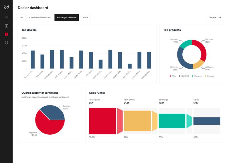
For the Dealer Dashboard, we used Power BI’s interactive filtering capabilities to allow executives to focus on top-performing dealers or regions with a single click. This intuitive navigation helped them identify problem areas and prioritize resources effectively.
Traditional vs. Optimized Navigation
| Traditional Navigation | Optimized Navigation |
|---|---|
| Overloaded with filters | Contextual filters only |
| Unclear tab names | Descriptive, user-friendly labels |
| Data visual clutter | Logical grouping of visuals |
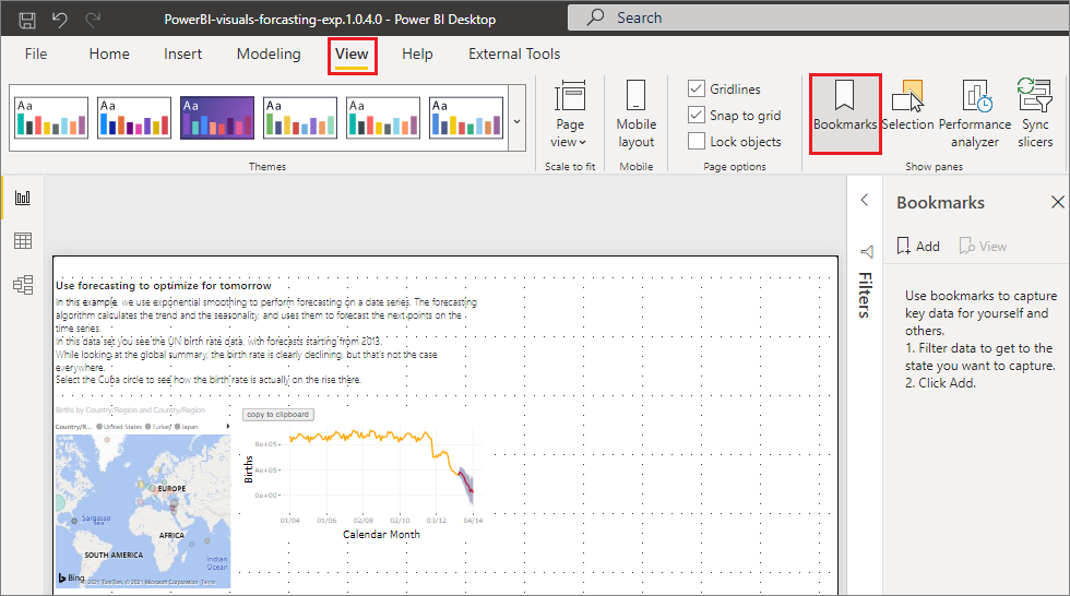
Pro Tip: Use bookmarks and buttons in Power BI UX to guide users intuitively.
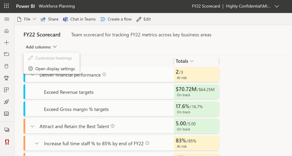
3. Create a Clear Visual Hierarchy
One of the most important dashboard UX design principles is visual hierarchy. Effective Power BI UI design ensures users can see the big picture first and dive deeper into details when needed. A clear visual hierarchy organizes information logically.
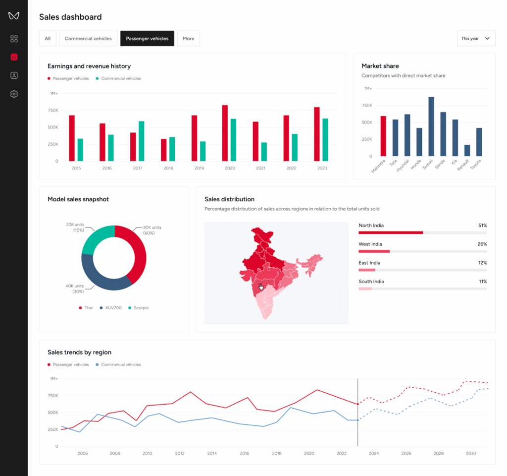
In the Sales Dashboard, we layered data visualization to present executives with a high-level regional sales summary. Users could then drill down into specific regions, seeing performance at the dealer level with just a click. This approach allowed decision-makers to quickly shift between overviews and granular insights.
Example Layout for Visual Hierarchy:
- Top Section: High-level KPIs (e.g., revenue, expenses, net profit).
- Middle Section: Supporting charts (e.g., sales trends, regional performance).
- Bottom Section: Detailed data tables or supplementary visuals.
Take a look at the Power BI hierarchies in Power BI scorecards
4. Consistency in Branding and Design
Consistency reinforces credibility and ensures a professional look and feel. Your dashboard should align with your organization’s branding standards.
Branding Elements to Include
- Company logo, placed subtly.
- Brand colors for charts, graphs, and accents.
- Fonts and typography consistent with corporate identity.
Actionable Tip: Use Power BI’s theme customization feature as shown in the image below to apply consistent branding across all reports.
5. Design for Mobile and Desktop Experiences
Enterprise users increasingly access dashboards on multiple devices. Ensuring dashboards are usable on both desktop and mobile screens is an important part of enterprise dashboard design best practices.
Power BI provides a mobile layout feature that allows designers to optimise dashboards for smaller screens.
Key Tips for Device Compatibility
- Use Power BI’s Mobile Layout to create device-specific views.
- Prioritize essential metrics and visuals for smaller screens.
- Test the dashboard on different devices to ensure responsiveness.
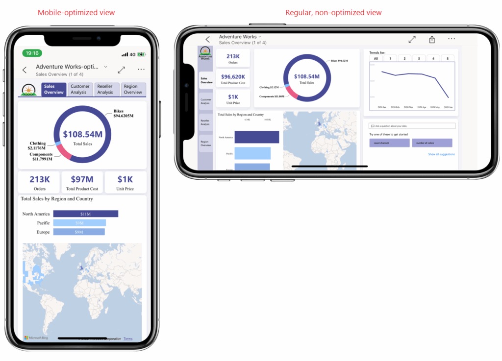
Mobile vs. Desktop Dashboard Design
| Mobile Design | Desktop Design |
|---|---|
| Minimal visuals, focus on KPIs | Comprehensive data visualization |
| Large buttons for touch screens | Interactive slicers and tooltips |
| Simplified navigation | Detailed multi-page navigation |
6. Optimize Use of White Space
White space isn’t wasted space; it’s a design element that creates balance and reduces visual clutter.
Why White Space Matters
- Enhances readability and focus.
- Prevents data overload by separating visuals.
- Creates a clean, professional aesthetic.
Actionable Tip: Use gridlines and alignment tools in Power BI to space out visuals evenly.
7. Use Color with Purpose
Color is a powerful tool that can either enhance or detract from a dashboard’s effectiveness. When used wisely, it improves comprehension and focus.
Best Practices for Color
- Use a limited color palette to maintain coherence.
- Apply consistent colors for recurring categories (e.g., blue for revenue, green for growth).
- Leverage contrast for readability (e.g., dark text on light backgrounds).
What to Avoid
- Overuse of bright, distracting colors.
- Relying on color alone to convey information (ensure accessibility for colorblind users).
These practices align with data visualization best practices in Power BI and help maintain visual clarity.
8. Maximize Interactivity
Interactivity transforms static dashboards into dynamic tools that empower users to explore data.
Interactive Features to Include
- Slicers and Filters: Allow users to segment data by time, region, or category.
- Drill-throughs: Enable deep dives into specific data points.
- Tooltips: Provide additional context without cluttering the visuals.
Pro Tip: Keep interactivity intuitive and avoid overloading users with too many options.
9. Ensure Data Accuracy and Clarity
Data integrity is non-negotiable. Even the most visually stunning dashboard loses credibility if the data is flawed. Ensuring clarity and reliability is essential for enterprise dashboard design best practices.
Tips for Accurate Data Presentation
- Use consistent formatting for dates, numbers, and currencies.
- Validate data sources and refresh schedules.
- Avoid overloading visuals with excessive data points.
Actionable Tip: Implement error handling and alerts for data discrepancies within Power BI.
10. Test, Iterate, and Improve
Dashboards evolve with user feedback and business needs. Regular testing ensures your Power BI designs remain relevant and effective.
For the automotive client, we conducted multiple iterations of the Dealer Dashboard, incorporating real-time user feedback. This iterative process refined the design, ensuring every stakeholder’s needs were met effectively.
Testing Checklist
- Are the dashboard objectives clear?
- Is navigation intuitive?
- Do visuals load quickly?
- Is the data accurate and up to date?
Actionable Tip: Use Power BI’s usage analytics to monitor how users interact with your dashboard.

11. Design Dashboards to Accelerate Decision-Making
Many dashboards focus on displaying metrics rather than helping users decide what to do next. Effective Power BI dashboards should reduce the time it takes for users to interpret data and take action.
Design dashboards so users can quickly answer questions such as:
- Are we performing as expected?
- What has changed compared to previous periods?
- Where should attention be focused first?
This can be achieved by pairing KPIs with meaningful context such as performance targets, trend indicators, or variance comparisons.
For example, showing revenue alongside month-over-month growth or target variance immediately tells the user whether performance is improving or declining. This approach reduces interpretation time and helps stakeholders move from insight to action much faster.
12. Build Dashboards Around Questions
A common mistake in Power BI reporting dashboards is listing metrics without defining the business question they answer.
Before designing visuals, identify the core questions the dashboard should resolve, such as:
- Which region is underperforming?
- Which product category drives growth?
- Which process is causing delays?
Once the questions are defined, visuals can be structured to guide users toward answers rather than simply displaying numbers.
13. Minimize Context Switching Across Reports
Users should not have to jump between multiple report pages to understand a single insight.
A good Power BI dashboard design reduces context switching by grouping related visuals within a single view. When deeper analysis is needed, drill-through pages should preserve the user’s filter context.
This ensures that users can explore insights without losing the analytical thread.
14. Align Layout with Natural User Scan Patterns
Most users scan dashboards rather than read them carefully. Research in interface design shows that users typically follow an F-pattern or Z-pattern when viewing digital layouts.
Power BI dashboards should place:
- Critical KPIs in the top-left region
- Supporting insights across the top and center
- Detailed breakdowns toward the bottom of the dashboard
This layout aligns with natural scanning behavior and improves comprehension.
15. Use Progressive Disclosure for Complex Data
Enterprise dashboards often contain complex datasets that can overwhelm users if displayed all at once.
Progressive disclosure helps manage this complexity by showing only the most important information initially while allowing users to reveal additional detail through:
- Drill-through pages
- Detailed tooltips
- Expandable visuals
- Secondary report pages
This keeps dashboards clean while still supporting deeper analysis.
16. Design for Data Trust and Transparency
Trust is one of the most critical factors in analytics adoption. If users question the accuracy of the data, they will stop relying on the dashboard entirely.
To reinforce trust, dashboards should include:
- When the data was last refreshed
- How key metrics are calculated
- Which data sources are used
- Whether figures represent estimates or confirmed values
When users trust the data, they rely on the dashboard for decision-making.
17. Align Dashboards with Organizational KPIs
Dashboards become far more valuable when they reflect the organization’s formal performance metrics. Instead of displaying isolated data points, Power BI dashboards should align with:
- strategic KPIs
- operational performance metrics
- departmental scorecards
When dashboards mirror the metrics used in management reviews and strategic planning, they become part of the organization’s decision infrastructure rather than just a reporting tool.
18. Reduce Cognitive Load Through Grouping
Cognitive load refers to the mental effort required to interpret information. Grouping related visuals together reduces cognitive strain and makes dashboards easier to interpret.
For example:
- Financial metrics grouped together
- Operational KPIs grouped separately
- Customer metrics displayed in another section
Clear grouping allows users to process information faster.
19. Design Dashboards for Continuous Monitoring
Dashboards are most effective when they support ongoing operational monitoring. This means prioritizing metrics that stakeholders review frequently and designing layouts that allow users to access insights quickly.
To support ongoing use:
- Prioritize frequently reviewed metrics
- Enabling quick filtering for time periods or departments
- Maintaining consistent layouts across report pages
- Optimizing performance so dashboards load quickly
Dashboards used daily must prioritize speed and clarity.
20. Measure Dashboard Adoption and Improve Continuously
A dashboard’s success should be measured by how often it is used and how effectively it supports decision-making. Power BI provides usage analytics that show:
- Which pages do users open most frequently
- Which visuals are interacted with
- How often are dashboards accessed
Monitoring this data helps organizations refine dashboards and keep them aligned with real usage patterns.
Common Mistakes to Avoid in Power BI Dashboard Design
Even well-designed dashboards can lose their effectiveness when certain usability issues slip in. Avoiding the following mistakes helps maintain clarity, improves Power BI dashboard usability, and ensures stakeholders trust the insights they see.
- Too many KPIs without decision context
Showing numerous KPIs without explaining what decisions they support can overwhelm users. Each KPI should clearly connect to a specific business objective or question. - Using tables as the primary visual on overview pages
Overview dashboards should highlight trends and key insights through charts and summary visuals. Large tables are better placed on detailed analysis pages where users can explore granular data. - Random or inconsistent use of colors
Color should guide attention and convey meaning. Using too many colors or applying them inconsistently makes dashboards harder to interpret. - Inconsistent filters across report pages
When filters behave differently from one page to another, users may struggle to understand what data they are viewing. Consistent filtering improves navigation and usability. - No clear metric definitions
If KPIs are not clearly defined, stakeholders may interpret the same numbers differently. Simple labels, descriptions, or tooltips help maintain alignment across teams. - Slow dashboards caused by heavy visuals or excessive interactions
Overloading dashboards with too many visuals, complex calculations, or interactions can reduce performance. Optimized visuals keep the experience smooth and responsive.
A Practical Power BI Dashboard UI/UX Pre-Build Checklist
Before publishing a dashboard, it is worth reviewing a few essential design and usability checkpoints. This quick checklist helps ensure your dashboard remains clear, structured, and reliable for the people who depend on it for decision-making.
Clarity
- Ensure each dashboard page answers one primary business question.
- Use clear KPI titles that include the appropriate units and time period.
- Show variance or comparison values such as performance vs target or vs previous period to provide context.
Layout
- Place key KPIs at the top, followed by supporting visuals that explain trends and drivers.
- Keep detailed tables or secondary visuals toward the bottom of the page.
- Maintain a consistent grid, spacing, and alignment so visuals appear balanced and easy to scan.
Usability
- Limit filters to only what users need and keep them predictable across pages.
- Use clear and consistent navigation labels so users can move between pages without confusion.
Trust
- Display the data refresh time so users know how current the information is.
- Provide metric definitions or tooltips to clarify how KPIs are calculated.
- Maintain consistent number formatting across the report to avoid misinterpretation.
Let’s Build Your Ideal Dashboard!
Your data deserves more than generic dashboards—it deserves expert craftsmanship. At Aufait UX, a leading UI UX company, we specialize in Power BI dashboard services and dashboard design services, transforming data into visually stunning, intuitive Power BI dashboards tailored to your business needs.
Why Choose Us?
- Expertise in dashboard UI/UX design principles for data visualization.
- Comprehensive Power BI dashboard services, from design strategy to implementation
- Strong understanding of Power BI capabilities, data modeling, and customization
- Experience designing enterprise dashboards aligned with the latest Power BI trends to improve data clarity and decision-making.
Get in Touch Today
Let us help you turn your data into your most valuable asset. Contact us now to schedule a consultation and see how we can elevate your Power BI experience!
Follow Aufait UX on LinkedIn for strategic insights grounded in real-world product outcomes.
Disclaimer: All images belong to their respective owners.
FAQs for Power BI Dashboard Design Best Practices
The most widely recommended Power BI dashboard design best practices include prioritising key performance indicators, maintaining a clear visual hierarchy, limiting unnecessary visuals, and ensuring consistent formatting. Dashboards should focus on answering specific business questions while presenting insights in a way that users can understand quickly. Applying structured layouts and intuitive navigation also improves overall dashboard usability.
A well-designed Power BI dashboard typically includes high-level KPIs, trend visualisations, comparison charts, and interactive filters. The dashboard should provide a quick overview of business performance while allowing users to explore deeper insights through drill-through or filtering. Following Power BI dashboard layout best practices helps ensure information is presented logically and clearly.
Most experts recommend limiting dashboards to five to eight primary visuals per page. Too many visuals can create clutter and reduce Power BI dashboard usability. Instead, focus on the most important metrics and use drill-through or additional report pages to provide deeper analysis.
An effective layout follows a simple hierarchy. Place key KPIs at the top of the dashboard, followed by charts that explain trends or comparisons in the middle section. Detailed tables or supporting visuals should appear at the bottom. This structure aligns with common enterprise dashboard design best practices and helps users quickly understand the most important insights.
Visual hierarchy ensures users see the most critical insights first. In designing effective Power BI dashboards, KPIs should be prominent while supporting visuals explain trends and underlying drivers. A well-defined hierarchy improves readability and helps decision-makers identify performance changes quickly.
Color should be used intentionally to highlight insights rather than decorate visuals. Following data visualization best practices in Power BI, dashboards should use a limited color palette, consistent category colors, and strong contrast for readability. Colors should also remain accessible for users with color vision deficiencies.
Filters and slicers allow users to interact with data dynamically. They help users analyze performance by categories such as region, time period, or product line. However, excessive filters can reduce Power BI dashboard usability, so designers should limit slicers to those that support meaningful analysis.
Common mistakes include overcrowding dashboards with too many visuals, inconsistent formatting, unclear KPI definitions, and poor navigation. Ignoring Power BI UI design guidelines can make dashboards difficult to interpret and reduce their effectiveness in supporting business decisions.
To improve usability, designers should simplify navigation, use clear labels, maintain consistent visual formatting, and highlight the most important metrics first. Applying dashboard UX design principles ensures dashboards remain intuitive and accessible to both technical and non-technical users.
Power BI dashboards should be reviewed periodically to ensure they remain aligned with business goals. Data sources, metrics, and reporting needs evolve over time, so dashboards should be updated regularly to maintain accuracy, relevance, and adherence to Power BI dashboard design best practices.
Table of Contents
Take control of your data story with powerful, intuitive Power BI dashboards.
Talk to our Power BI Dashboard expert!