HMI Design Best Practices: The Ultimate Guide to Optimized Human-Machine Interfaces

Get ahead in HMI design with actionable tips and insightful time-tested strategies.
It’s the age of HMI (Human-Machine Interface), where intuitive dashboards and touch screens facilitate effective communication between humans and machines.
HMI typically refers to screens or dashboard designs that convey information, data, and metrics through graphics or visual representations of numbers.
Operators( users)oversee and manage equipment and processes in factories and plants through these screens. So, HMIs play a crucial role in modern manufacturing processes, enabling efficient, safe, and reliable operation of complex machinery.
By 2028, the HMI technology market is projected to reach USD 7.7 billion, reflecting increasing adoption of industrial automation in process and discrete industries.
As industries increasingly rely on HMI technology to enhance operational efficiency, reduce labor costs, and improve productivity, the importance of thoughtful HMI design becomes evident.
In this article, we discuss some important aspects of HMI design with a specific thrust on HMI UI/UX design best practices.
What is HMI Design
HMI design refers to the creation of intuitive and user-friendly interfaces that facilitate interaction between humans and machines in various applications. These interfaces typically utilize visual elements, such as graphics, icons, and touchscreens, to convey information and enable control of machinery, equipment, or systems.
Here are some HMI design examples based on the areas of application:
- Touchscreen control panels in manufacturing plants allow operators to monitor and adjust production parameters with simple gestures.
- Dashboard displays in automotive vehicles present vital information such as speed, fuel level, and navigation instructions in a clear and accessible manner.
- Smartphone apps for smart home devices enable users to remotely control lighting, temperature, and security systems with a few taps on their mobile device.
- ATM interface guide users through banking transactions with easy-to-understand menus and prompts.s
- Medical device interfaces in healthcare settings provide clinicians with real-time data and controls for patient monitoring and treatment.
- Pilots navigate, communicate, and monitor aircraft status using HMIs in aircraft, ensuring safe and efficient flight operations.
Evidently, there is a diverse array of HMI-based systems across various industries. While different industries may require unique functionalities and layouts for their systems, at their core, the fundamental principles of good design persist. Adhering to best practices in HMI design is critical for success and effectively reducing human errors.
Here are the HMI Design Best Practices
Design plays a major role in the effectiveness of HMI systems. A well-designed HMI is intuitive, user-friendly, and caters to the specific needs of the industrial process. With a clear and concise display of information, ease of control system, and prompt communication with operators, these goals are achieved. Reducing this operator workload helps users to maintain focus in high-pressure environments. What are some HMI design best practices that can reduce the cognitive load and boost operator performance? Let’s take a look.
#1 Reduce Cognitive Load: Put Data Into Context
Improving operator awareness isn't just about showing data—it's about putting that data into context. Dr. Mica Endsley, P.E., breaks down the process into three steps:
- Perceiving
- Understanding, and
- Predicting
It's not enough for operators to see numbers, they need to understand what those numbers mean and foresee what might happen next. This is why “ Idiot Proofing” is considered a key requirement in HMI design.
Idiot Proofing
"Idiot-proofing" refers to the deliberate efforts to eliminate the possibility of inadvertent critical actions. This involves optimizing button spacing to ensure adequate spacing between buttons to prevent accidental touches, particularly crucial on touch screen HMI consoles commonly found on factory floors.
Also, utilizing color to denote the criticality of certain activities, offering operators visual cues to confirm their actions and avoid potential errors.And adjusting the size of buttons and controls to suit touchscreen interfaces, minimizing the risk of unintended inputs due to cramped layouts.
In practical terms, this means providing information like alarms and trends in a way that's easy to understand. Responding to a critical situation by just seeing some current system values without understanding the context can lead to mistakes. So, give operators the information they need to make informed decisions before problems arise.
Here are some ways to give operators the context they need to perform at their best:
Present data that matches the mental model of the operator.
This means structuring information in a way that resonates with operators' understanding of the system's dynamics.
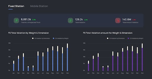
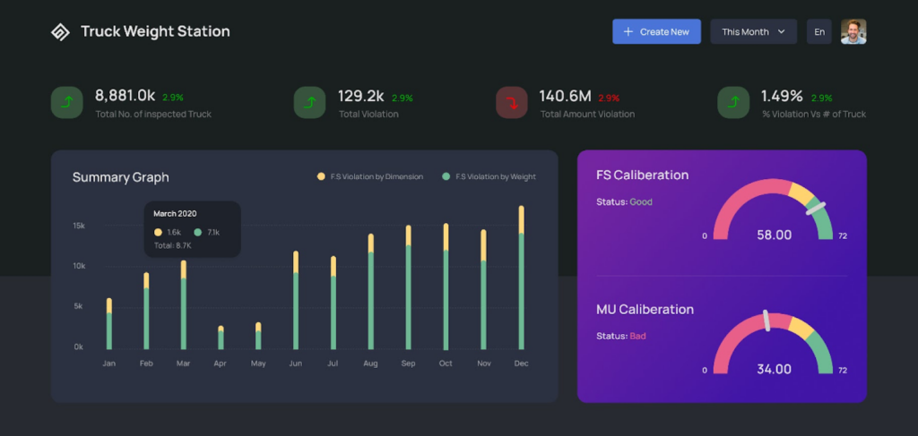
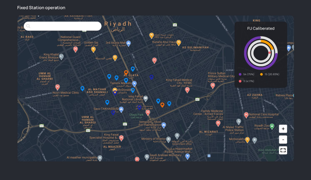
Idiot Proofing: Make important information stand out
Employ visual cues, distinct formatting, or strategic placement to draw attention to critical insights and to make the information easily digestible and relevant as you can see from the image. It's a Truck weighing Station interface and clearly shows the data on the inspected trucks and the violation data.
Provide information with the data
Present data in a visually appealing format that facilitates immediate comprehension. Utilizing charts, graphs, and other graphical elements can help convey complex data relationships more intuitively.
#2 Ease Navigation to Guide Operators with Precision
Clutter-free navigation within an HMI system ensures swift and intuitive access to desired functionalities for the operators. For this, focus on the user journey and think from users’ shoes. Here are some best practices to enhance navigation:
Consistent Placement of Important Buttons
Maintain essential buttons, such as home or main screen access, consistently visible across all screens. This ensures operators can easily navigate back to critical areas without unnecessary searching or disruptions to their workflow.
Minimal Click Accessibility
Aim to keep all screens within two to three clicks from the home or main screen. By reducing the number of steps required to reach key destinations, operators can efficiently navigate the interface and complete tasks with minimal effort.
Task-Oriented Layout Design
Prioritize understanding the workflow of the operational process. Identify tasks that are frequently performed and those that are less common. Design the layout of the HMI to prioritize frequently used functions, placing them within easy reach and minimizing the need for operators to navigate through multiple screens for routine actions.
Efficient Information Architecture
Design the information architecture to be as efficient as possible, organizing HMI screen designs and menus logically based on the operators' workflow and task priorities. Group related functions together and provide clear pathways to navigate between different sections of the interface.
User-Centric Navigation Testing
Conduct usability testing to evaluate the effectiveness of the navigation design. Solicit feedback on the intuitiveness of the navigation flow and adjust the design based on user input to optimize usability and avoid common HMI usability pitfalls that can disrupt operator efficiency.
#3 Wisely Choose Colors and Fonts
The choice of colors and fonts holds significant sway over usability and readability. Here's how to make wise selections:
Color Usage
- Limit the palette: Avoid overcrowding screens with excessive colors. Stick to a restrained selection, reserving bright hues for highlighting abnormal conditions like alarms.
- Consistency is key: Ensure colors are used consistently throughout the interface to maintain clarity and aid user comprehension.
Font Selection
- Prioritize legibility: Opt for clear and easily readable fonts to enhance user understanding in HMI UI design.
- Contrast is crucial: Choose fonts with sufficient contrast against the background to ensure text stands out prominently as you can see from the image.
Adaptability to Lighting Conditions
Make sure the colors and brightness of the display can be adjusted to suit different lighting environments, ensuring optimal readability at all times.
Text and Control Optimization
Optimize the size and spacing of text and control elements for maximum visibility and ease of use, accommodating users of varying needs and preferences.
#4 Include Graphics Strategically
Graphics are visual languages that break linguistic barriers and facilitate rapid comprehension for operators. Here's how to effectively integrate graphics into UI HMI design:
Visual communication
- Capitalize on the efficiency of image as operators grasp the meaning of visuals faster than text or colored buttons as we have done in the Truck Weighing Station Interface project.
- While graphics are invaluable, excessively large or numerous graphics, as well as complex animations, can hinder HMI screen design performance. Limit their use or isolate them on separate screens to maintain swift response times on primary screens.
Efficient Data Display
- Different types of data necessitate varied display methods. For instance, while a numerical value may accurately convey speed, uncertainty regarding engineering units and acceptable ranges persists. Mitigate this ambiguity by supplementing numerical displays with appropriate labels and range indicators.
- Line graphs with trending functions provide a display of past and present data, facilitating intuitive interpretation of future trends. Operators can understand whether values are approaching upper or lower limits, aiding proactive decision-making.
Now that we have dealt with UI/UX design best practices of HMIs, it's crucial to ensure compliance with international standards. Let's get into that in the next section.
#5 Adhere to HMI Design International Standards
When designing an HMI interface, it is crucial to adhere to international standards to ensure usability and efficiency. In HMI UI/UX design, ISO 9241-110: Ergonomics of human-system interaction - Part 110 Dialogue principles provides the general principles and guidelines. Here are some key points from the standards:
- General Appearance and Behavior: The interface should include buttons, saliences, and dialog boxes. These objects can be selectable or non-selectable, with selectable objects initiating actions.
- Button Design: Buttons should be large enough for easy selection on touchscreens, with a recommended minimum size of approximately 1.5 cm on the shortest side. Button behavior can be momentary or two-state, with clear visual indicators for the selected state.
- Saliences: Colored or textured saliences should be used to indicate the condition of buttons and other objects, such as alarms or required user attention.
- Dialog Boxes: Dialog boxes are used for supplemental information, user input, or error reporting. They should include a title bar, display area, and window control buttons (e.g., OK, Cancel).
- Navigation Model: The basic network navigation model should minimize user actions and time. It has to allow users to move horizontally between different sections of the panel without the need to navigate up and down menus.
- Display Layout: The basic layout includes four panels—title, information, command, and navigation. If the panels are tiled edge to edge, the interface should support left-hand orientation for the command panel.
- Title Panel: The title panel should contain essential information such as host communications status, date/time, current view name, and optional elements like corporate identifiers or logos.
#6 Implement Error Prevention and Safe Interaction Design
A well-crafted HMI UX design should minimize the risk of operator errors and ensure safety in high-risk environments such as industrial automation, medical devices, and aerospace.
Beyond usability, HMI design also carries ethical considerations that protect users, prevent errors, and promote trust. When operators know that the interface has been thoughtfully designed to safeguard against mistakes, they can engage with the system more confidently and focus on their tasks without fear of unintended consequences.
Best HMI UI/UX Practices for Error Prevention:
- Use Confirmation Prompts: Prevent accidental actions by prompting users before executing critical commands.
- Error Feedback & Recovery: Provide clear, actionable messages to guide users in case of an error.
- Prioritize Critical Controls: Design touchpoints and buttons to prevent unintended activation (e.g., emergency stop buttons should be distinct and easily accessible).
- Highlight System Status in Real Time: Use color-coded alerts and animated indicators to ensure operators always have situational awareness.
These practices reflect the essence of HMI design thinking, where usability principles are applied to safeguard high-stakes environments. One of the notable HMI design examples is that of aviation HMI screens, in which users could see a confirmation dialog that prevents pilots from unintentionally shutting off essential flight systems.
#7 Prioritize Accessibility and Inclusivity in HMI UX Design
Operators come from diverse backgrounds, with different physical abilities, cognitive skills, and environmental conditions affecting their interaction with an HMI system. A well-designed accessible interface ensures all users can navigate it efficiently.
Key Accessibility Considerations for HMI UX/UI design:
- Use High-Contrast Visuals: Design for color-blind users by ensuring adequate contrast between critical elements.
- Enable Text Scaling: Allow users to adjust font sizes for better readability.
- Alternative Input Methods: Incorporate keyboard navigation, voice commands, and haptic feedback for users with mobility impairments.
- Design for Low-Light & High-Glare Environments: Implement dark mode options and adaptive brightness for different working conditions.
For example, Factory floor HMIs often have adaptive contrast displays to remain visible under extreme lighting conditions.
#8 Optimize HMI Systems for Multi-Device & Multi-Platform Use
Modern HMI screen designs are no longer confined to single-screen terminals. With cloud computing and IoT integration, operators need multi-device access to critical data across various platforms.
How to Optimize HMI for Multi-Device Usability:
- Use Responsive UI Design: Ensure the interface scales well across desktop monitors, tablets, and mobile devices.
- Enable Remote Monitoring: Design cloud-based HMIs that allow operators to access dashboards from anywhere.
- Ensure Consistent UI Elements: Maintain uniformity by applying HMI design principles consistently across platforms to reduce the learning curve.
- Optimize for Touch & Gesture Controls: Since operators may switch between touchscreens, keyboards, and styluses, ensure input adaptability.
Industrial automation companies like Siemens and Rockwell Automation are the best HMI design examples that use cross-platform HMI screens to allow operators to monitor equipment remotely via tablets.
#9 Design for Scalability and Future-Proofing
As technology evolves, HMI designs must remain adaptable to new hardware, software updates, and process changes. A scalable HMI design reduces the need for frequent redesigns and enhances long-term usability.
Best Practices for Scalable HMI UX Design:
- Modular UI Components: Use customizable widgets that can be easily updated as system requirements change.
- Support for Future Integrations: Ensure API compatibility with IoT devices, AI-driven analytics, and automation tools.
- Adaptable User Roles: Design role-based interfaces where different users (e.g., supervisors vs. operators) see only relevant controls.
- Flexible Data Representation: Allow users to customize dashboard design layouts to display the most relevant metrics.
SCADA systems in manufacturing use modular HMI dashboards that allow engineers to integrate new sensors, machines, and automation controls without requiring a full redesign.
#10 Ensure Efficient Data Visualization and Decision Support
The primary goal of HMI dashboards is to provide actionable insights in real time. Well-structured data visualization can reduce decision-making time and improve operator efficiency.
How to Improve Data Visualization in HMI UX:
- Use Intuitive Graphs & Charts: Instead of raw numbers, present trends using line graphs, bar charts, and heatmaps.
- Apply Predictive Analytics: Use AI-driven dashboards that highlight potential failures before they occur.
- Ensure Logical Information Hierarchy: Display the most critical data first, with drill-down options for deeper insights.
- Leverage Color Coding & Animations: Use flashing alerts and color cues to indicate urgent changes in system performance.
Automotive HMIs in electric vehicles (EVs) use interactive energy flow diagrams to show real-time power distribution across battery systems.
HMI Development Best Practices
While design principles ensure that HMIs are intuitive and user-friendly, development best practices guarantee that these systems are technically reliable, scalable, and secure. A well-designed interface can fall short if it is not backed by a robust development foundation.
Here are some key practices that complement design excellence with engineering strength:
- Modular and Scalable Architecture – Build HMIs with reusable components and flexible frameworks so they can adapt to new processes, devices, or automation tools without complete redesigns.
- Performance Optimization – Keep response times fast by minimizing latency, using lightweight code, and optimizing graphics rendering for real-time updates.
- Security by Design – Implement role-based access, encrypted communications, and compliance with industrial security standards (like IEC 62443) to safeguard critical operations.
- Reliability and Fault Tolerance – Incorporate redundancy, error recovery, and event logging to ensure systems remain stable even under stress.
- Interoperability with Standards – Support industrial protocols such as OPC UA, Modbus, and MQTT, ensuring smooth integration with PLCs, SCADA, and cloud platforms.
By weaving together strong design practices and disciplined development practices, organizations can create HMIs that deliver speed, reliability, and long-term adaptability.
Real HMI Design Examples Shaping Everyday Industries: Beyond the Screen
HMI design is not merely screens and buttons, it's about taking complicated data and making it clear, stress-free, and making it confident, and taking action and making it outcomes. Done well, HMI becomes an unseen partner, helping users navigate decisions in high-risk environments without overloading them. Let's explore some real-world HMI design examples that demonstrate just how strong and varied HMI design can be across industries.
1. Automotive Industry – Tesla and BMW iDrive
Tesla has arguably remade the electric vehicle user experience by putting HMI front and center in its car interiors. The big middle touchscreen doesn't merely manage the radio or air conditioning; it provides drivers with access to things like vehicle diagnostics, navigation, and energy usage, all via a sleek, context-sensitive UI. It adjusts dynamically with driving mode, road type, or even user preference. No clutter. Simply smart, adaptive design.
BMW's iDrive system, however, combines tactile controls with digital menus. Rotary knobs, voice commands, or gesture control can be used to drive the system by the driver. The menu is designed in a layered form so that necessary functions are never far from reach, thereby reducing distraction and improving road safety.

📍For a deeper dive into this domain, see our detailed article on HMI design principles in automotive UX
2. Industrial Automation – Siemens SIMATIC HMI Panels
In factory floors where seconds count, and machinery conditions are everything, Siemens SIMATIC HMI panels impose order over chaos. Their interfaces enable the operators to scan production lines, identify glitches, and execute instructions in real time. Color-coded statuses, escalated error levels, and instantaneous feedback are favored when designing their arrangements to limit operator errors. For example, a machine overheat isn't simply indicated as a red icon, it includes historic temperature charts, maintenance recommendations, and a guided shutdown process, all on the same panel.

3. Aviation – Boeing 787 Dreamliner Cockpit
Aviation pilots are constantly pressured to make accurate decisions at cruise altitudes. The Boeing 787 Dreamliner cockpit demonstrates a breakthrough in HMI with its "glass cockpit" design. Conventional analog dials are substituted by dynamic, high-resolution screens that change according to flight stages, takeoff, cruise, and landing. Instead of displaying all information simultaneously, the interface focuses on filtering and prioritizing data. Weather alerts, fuel levels, airspeed, and engine performance appear as necessary, eliminating mental overload for long-haul flights.

4. Healthcare – Philips IntelliVue Monitors
In hospital ICUs, nurses depend on timely, precise data to meet patient needs. Philips IntelliVue patient monitors are engineered with multi-layered, hierarchical views of data. Real-time vital signs are displayed, but more crucially, the interface can identify critical conditions and initiate alerts with intelligent visual feedback, flashing signals, color-coded graphs, and soft alarms that differentiate levels of urgency. This HMI design enables quick response without risking information overload.

5. Smart Buildings – Schneider Electric's EcoStruxure
New smart buildings employ advanced HMI dashboards such as Schneider Electric's EcoStruxure Building Operation. Facility managers can monitor HVAC efficiency, lighting use, energy use, and occupancy patterns, all from one integrated digital platform. The interface employs interactive floor maps, heatmaps, and energy trendlines to provide actionable information. If a conference room is using more energy than it usually does, the HMI not only notifies the user but also provides historical comparisons and recommendations for corrective action.

6. Food & Beverage – Coca-Cola's Automated Bottling Line
Operators in Coca-Cola's high-rate bottling facilities watch thousands of bottles pass by each minute. In these facilities, HMI systems with SCADA interfaces graphically represent the whole bottling process. They are capable of monitoring deviations in pressure, temperature, or cap positioning—each of them graphically depicted on a flow diagram. Real-time warnings enable personnel to identify the precise position of a fault without stopping production altogether.
7. Semiconductor Manufacturing – SmartFactory Unified Process Control
In semiconductor manufacturing, HMI systems must cope with some of the most demanding conditions in industry, nanometer-level precision, strict cleanroom protocols, and thousands of process variables running simultaneously. SmartFactory’s Unified Process Control (UPC) platform is a real-time example of this. It consolidates data from etching, deposition, and inspection tools into unified dashboards where operators can track wafer status, chamber conditions, and alarms in a single view. By presenting traceability metrics and performance trends clearly, the HMI enables engineers to spot deviations early, prevent contamination or misprocessing, and protect multi-million-dollar production lots.
📍For a detailed look at how HMIs are designed and applied in semiconductor manufacturing, explore our Complete Guide to HMI Design in Semiconductor Manufacturing.
Maximize HMI Efficiency Through Thoughtful Design
A well-executed HMI UX design is crucial for optimizing operator performance and overall system functionality. Users prioritize three key attributes in a product: speed, reliability, and ease of use. By adhering to the best design practices outlined here, these objectives can be effectively realized.
As a leading UI UX design company, we have expertise in HMI UX design services and these design practices are drawn from our experience. Failure to prioritize design may lead to under featured HMI systems, ultimately resulting in increased expenditure and user dissatisfaction over time.
If you have any queries, don't hesitate to reach out to us! Let us prepare a detailed chart for your HMI design needs.
HMI Screen Design FAQs
HMI (Human-Machine Interface) design refers to the creation of intuitive, user-friendly interfaces that allow operators to interact with machines, systems, or processes. It includes touchscreens, dashboards, control panels, and industrial UI used in manufacturing, healthcare, automotive, and smart devices.
Effective HMI screen design follows these principles:
• Simplicity & Clarity – Avoid clutter and present essential information concisely.
• Consistent UI Patterns – Maintain uniform layouts, buttons, and fonts across screens.
• Error Prevention – Use confirmation dialogs and alerts to reduce mistakes.
• User-Centered Approach – Design based on operators’ workflows and real-world conditions.
• Reduce cognitive load by presenting data in context.
• Use intuitive navigation with a clear menu structure and minimal clicks.
• Employ visual hierarchy to emphasize critical system states.
• Ensure accessibility with high-contrast themes and scalable text.
• Optimize for touchscreens with properly spaced buttons and gesture controls.
An HMI design template is a pre-built UI framework that provides structured layouts, buttons, icons, and color schemes for creating consistent HMI screens. Many industrial automation companies offer ready-to-use HMI templates that adhere to industry standards.
Some real-world HMI design examples include:
• Siemens and Rockwell Automation HMIs for industrial process monitoring.
• Tesla’s automotive dashboard UI with touch-based controls.
• Medical device interfaces for real-time patient monitoring.
• SCADA systems for factory automation and remote operations.
Popular HMI design software includes:
• Ignition by Inductive Automation – SCADA & industrial HMI development.
• Wonderware by AVEVA – Advanced industrial and manufacturing HMI solutions.
• WinCC by Siemens – Customizable industrial control interfaces.
• FactoryTalk View by Rockwell – Scalable HMI solutions for factory automation.
• Sketch & Figma – Used for prototyping HMI UI before final implementation.
The best HMI design is one that is:
• User-friendly & intuitive – Easy to navigate with minimal training.
• Visually clear – Uses contrast, color coding, and typography for easy readability.
• Efficient – Reduces operator workload by displaying only relevant data.
• Safe & reliable – Prevents errors and ensures operational safety in industrial environments.
• HMI UI Design focuses on the visual elements, such as layout, colors, fonts, and icons.
• HMI UX Design emphasizes the user experience, ensuring smooth navigation, usability, and accessibility.
A well-designed HMI UX/UI leads to faster decision-making, fewer errors, and improved efficiency in industrial environments.
Good HMI design principles improve usability by:
• Organizing data logically for quick comprehension.
• Using familiar UI patterns to reduce learning time.
• Ensuring touch-friendly interfaces with large buttons and intuitive gestures.
• Incorporating real-time feedback to enhance user awareness and control.
Following HMI design best practices ensures:
• Operational efficiency – Reduces human errors and streamlines workflows.
• Enhanced safety – Prevents accidents by providing clear alerts and instructions.
• Faster learning curve – Minimizes training time for new operators.
• Future-proofing – Ensures scalability for evolving industrial and digital environments.
Table of Contents